THROWBACK THURSDAY
Before we had ever heard of a blog, a DSLR camera, or a hastag (they were still called “pound” signs back then), we were designing and renovating. So we are excited to kick off “Throwback Thursday Renovations” here on the blog, and to take a trip each Thursday down renovation memory lane. We will be looking back at some of our favorite projects, our live & learn moments, and the before & after transformations!
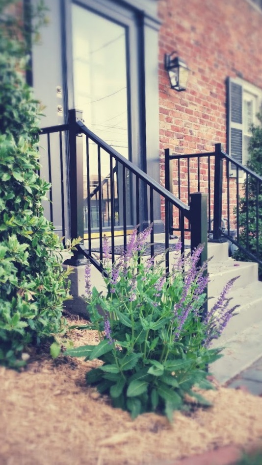
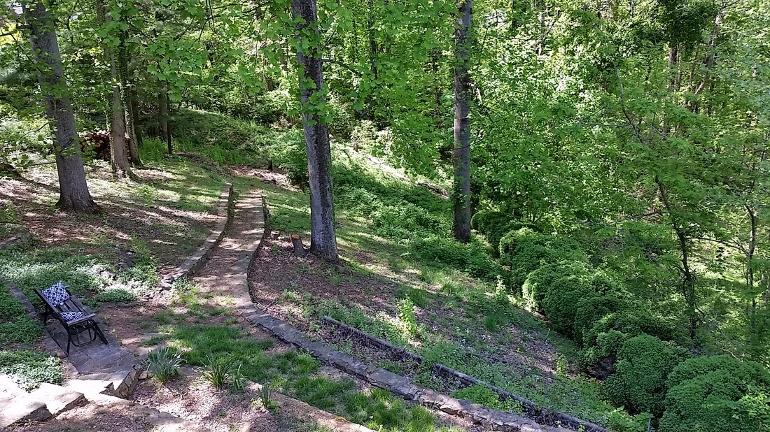
Today we are we are looking back at our renovation of a historic Colonial which we nicknamed “the treehouse” for its beautiful, treetop views. The house is a 1942 Colonial. It has three floors (each floor its own apartment) and was built by a family who owned a local hardware store. The wife enjoyed gardening, and stories say every Saturday a master gardener would come over and the two would spend the entire afternoon tending to the backyard gardens and terraces. By the time we bought the property the gardens were sadly overgrown and most beyond repair, but the stone terraces still stand in their beautiful glory and offer great spots for perching and enjoying the backyard. The grounds feel like a city park — that you can live in! And it is all within walking distance of great restaurants, groceries, shopping, and coffee.
The location is what immediately sold us on the property, and though we loved the home itself as well (a traditional Colonial with a grand, curved entry staircase) the house was in need of a full, gut renovation. We were up for it! The house had been neglected over the years, undergone some cheap renovations, and been pimped out as cheap rentals. But we were giddy-eager to restore its grand charm and renovate the property to embrace the history, indoor-outdoor living opportunities, and historic neighborhood. We replaced all the electrical, plumbing, heating & cooling systems. We renovated all three floors, got rid of the boiler room and created a beautiful laundry. We replaced doors and windows and upgraded the decks. We spent months digging up massive, dead boxwoods and transplanting the few survivors to places around the property where they could thrive. We renovated the nearly 3,000 square foot home top to bottom, working to maintain the original historic charm while infusing it with modern luxuries — because a modern girl needs a dishwasher! And marble floors. ;)
Today we’re looking back at the upper floor — the “treehouse” apartment — of that beautiful Colonial…
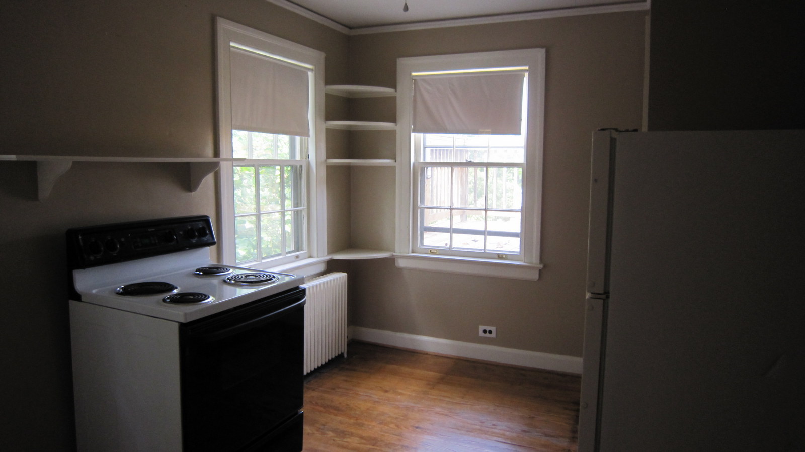
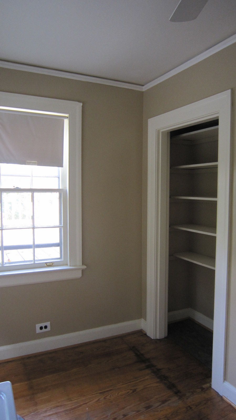
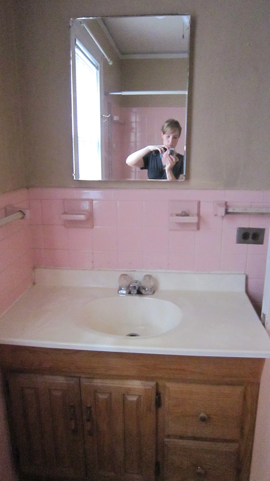
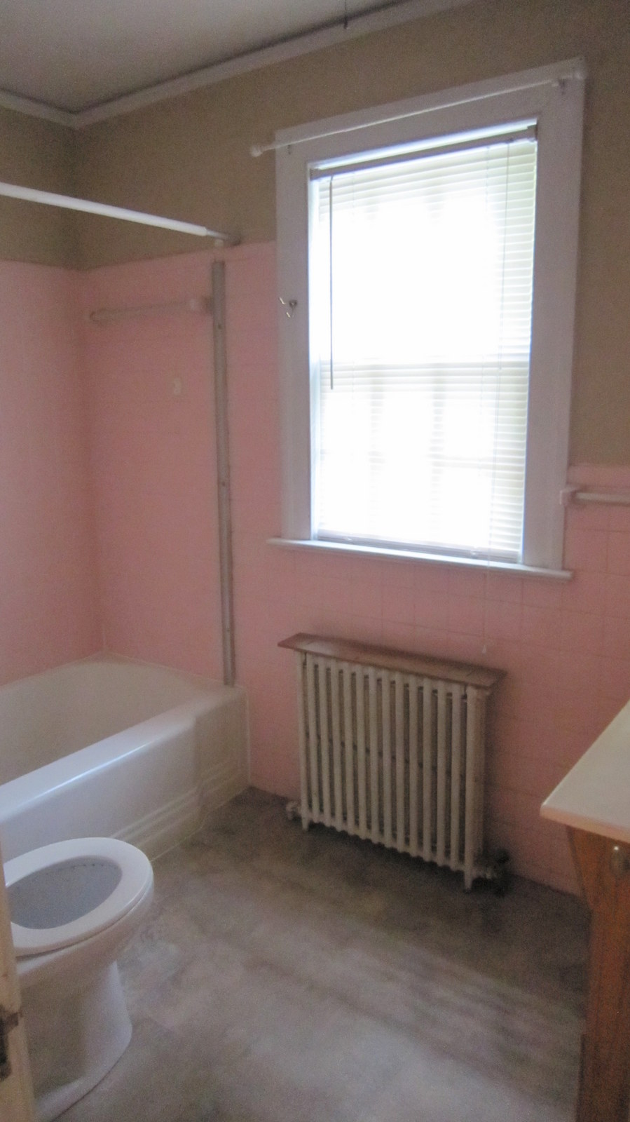
THE BEFORE
RENOVATIONS IN PROGRESS
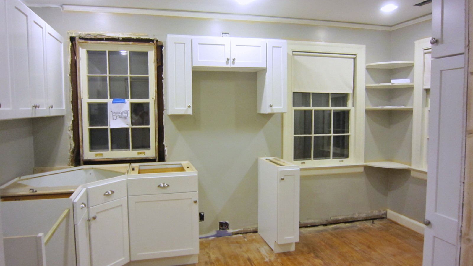
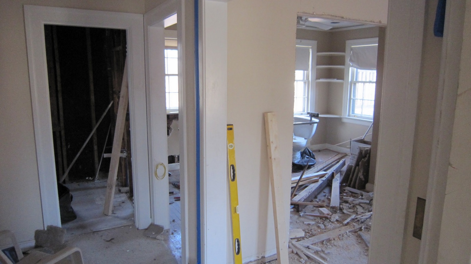
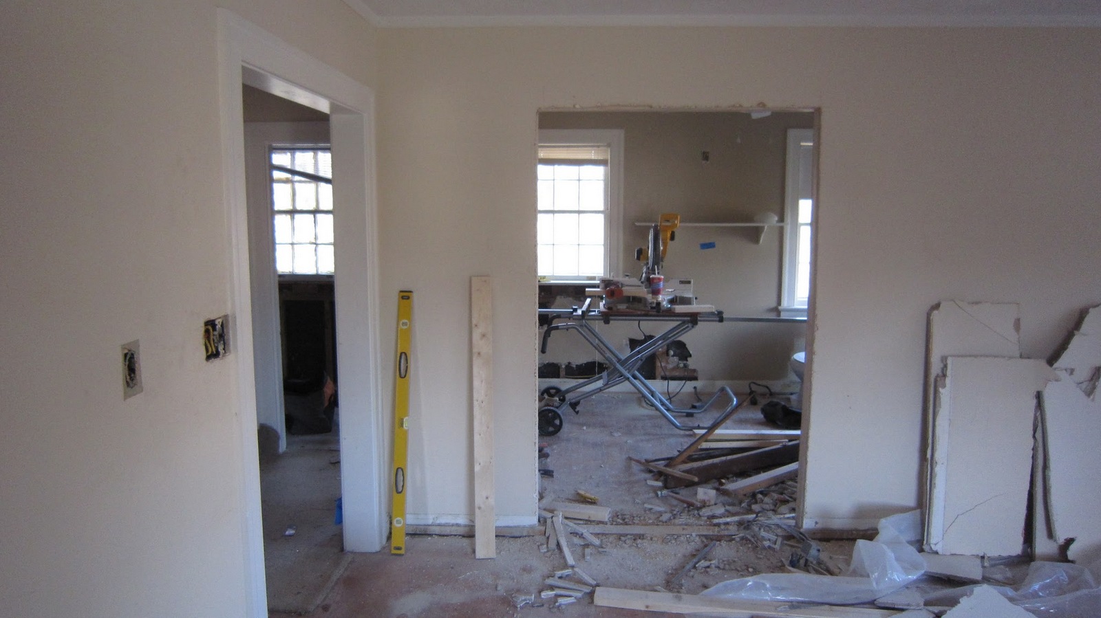
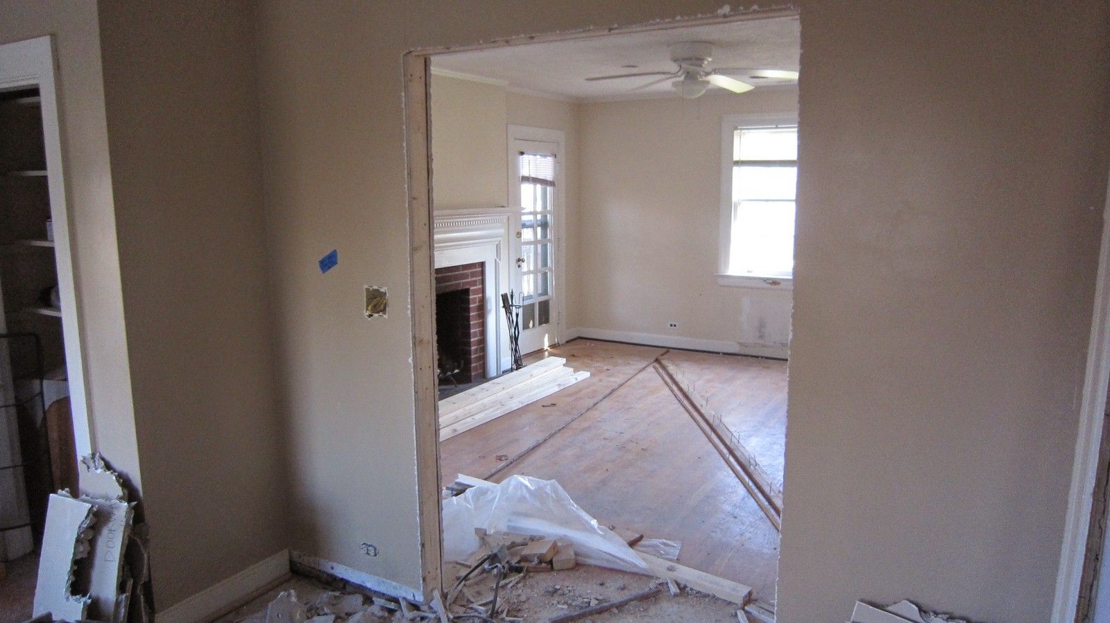
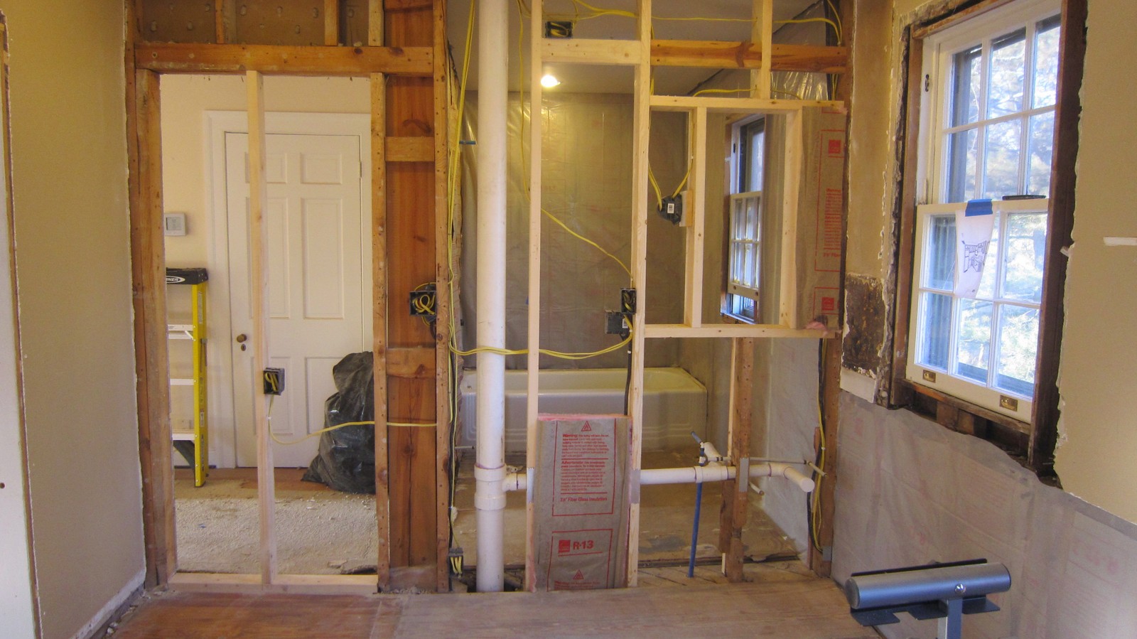
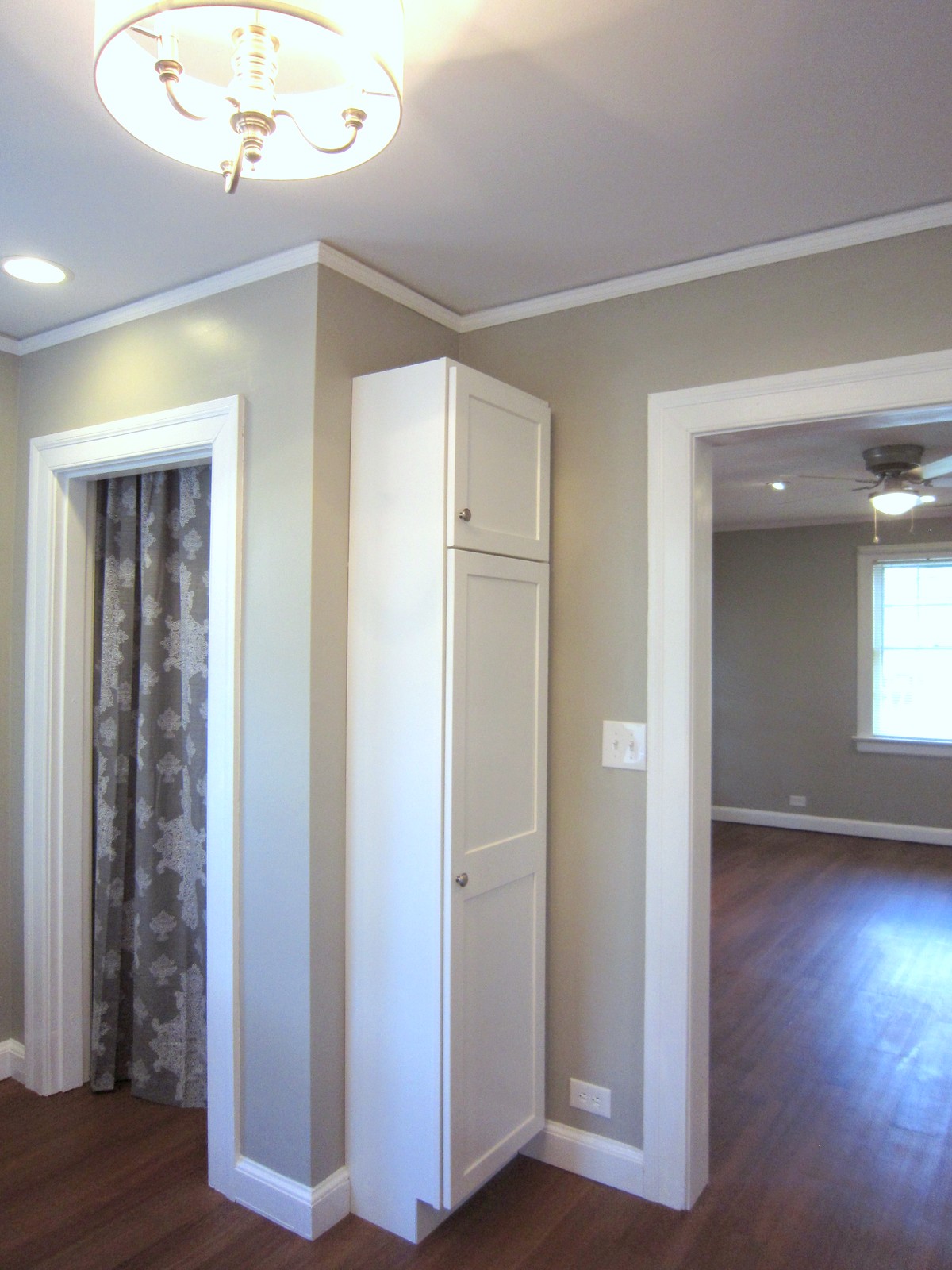
Knocking Down Walls. The apartment needed a better layout, particularly to maximize what was a large but oddly laid out kitchen. Thankfully the kitchen-living room wall was not structural, so we were easily able to close in the kitchen’s original hall entry and instead create a four foot opening between the living room and kitchen. We scrounged up every bit of original molding we could so that we could reframe the new opening with original moldings, doing our best to make this new layout feel original to the house.
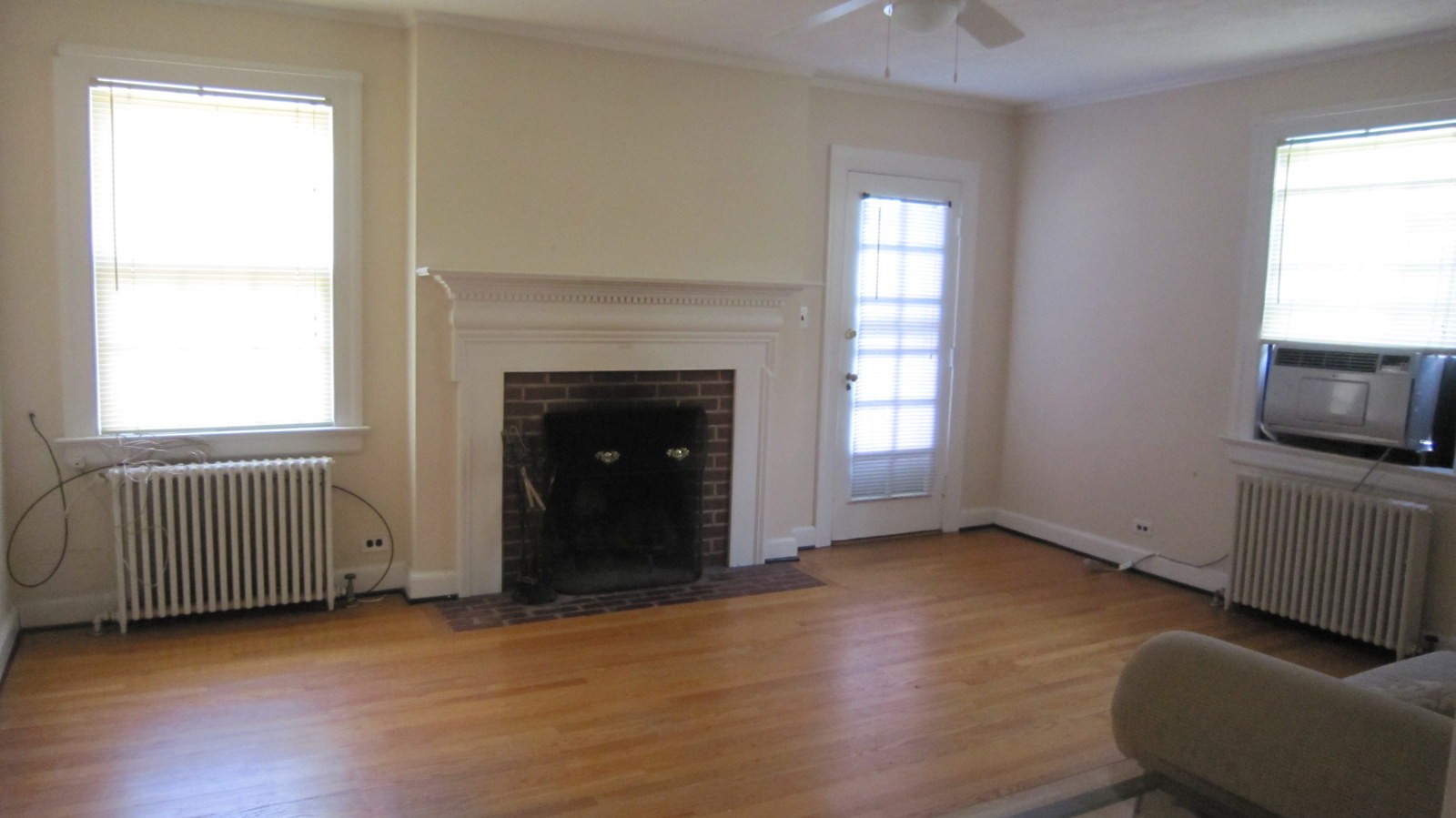
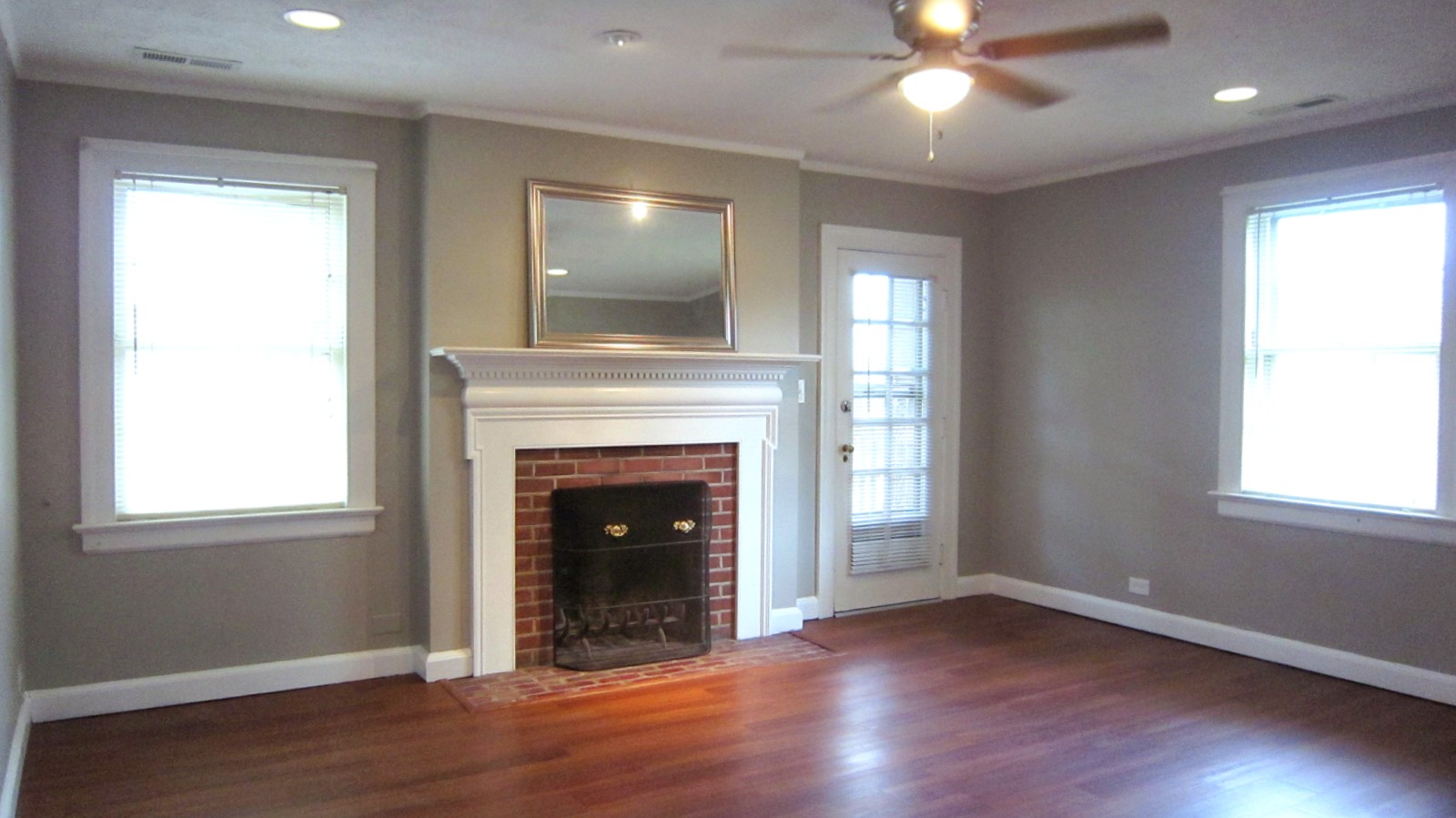
The new connection between the living room and kitchen not only improved the kitchen layout but provided bright, beautiful sight lines from the front to the back of the house, making the newly connected rooms feel even larger. The view from the kitchen now provides views of the original wood burning fireplace. You can also see the doorway to the deck which offers some of the BEST views in the neighborhood!
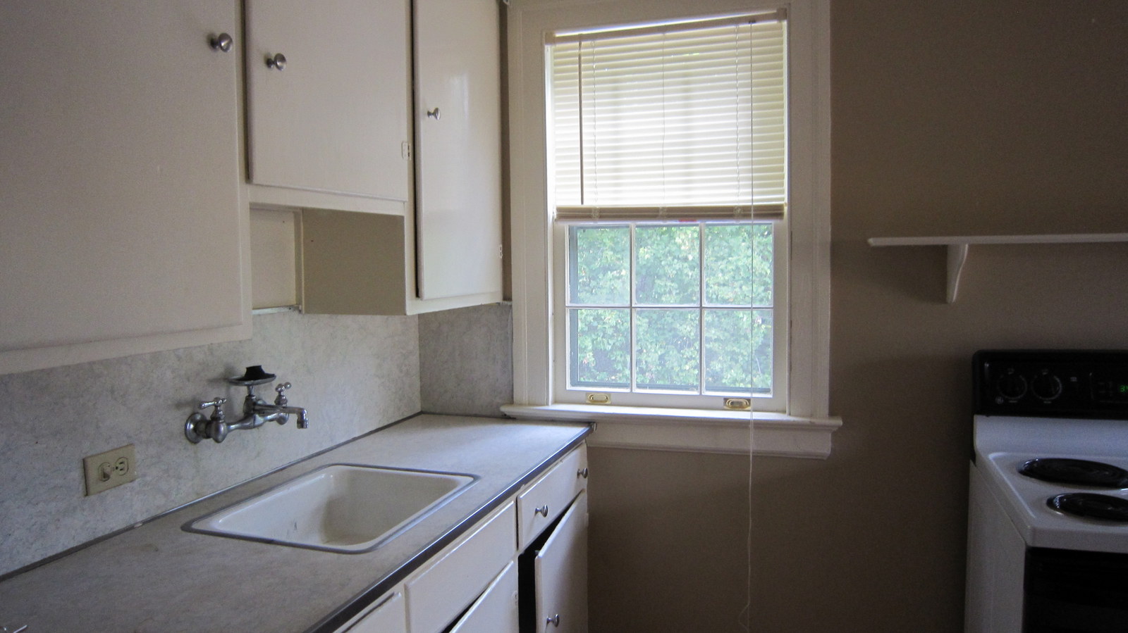
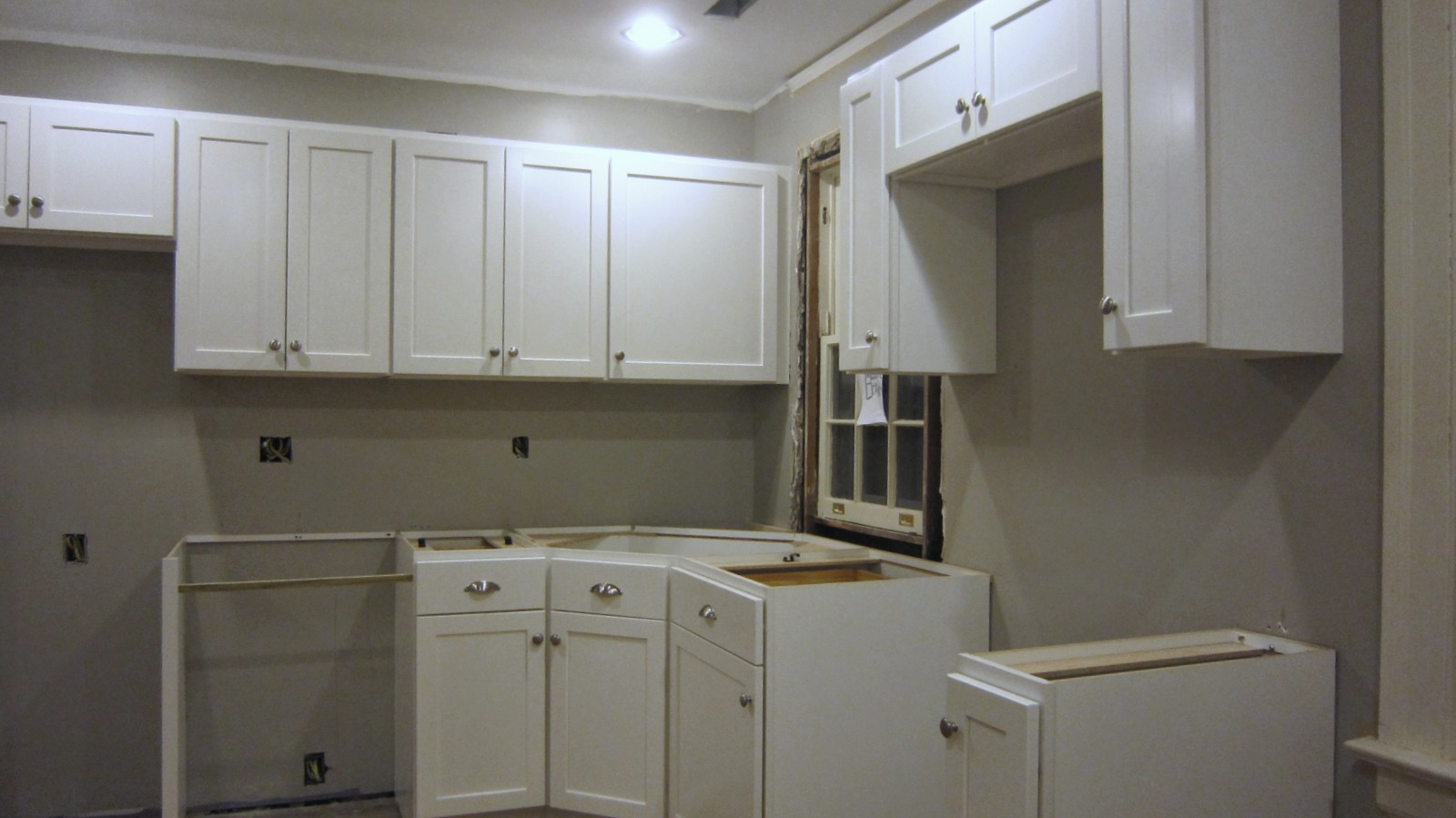
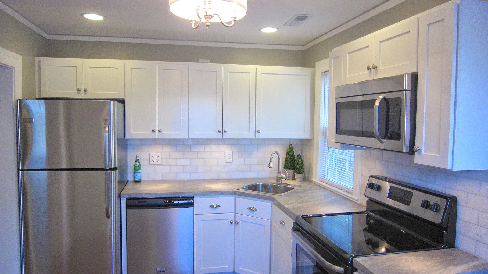
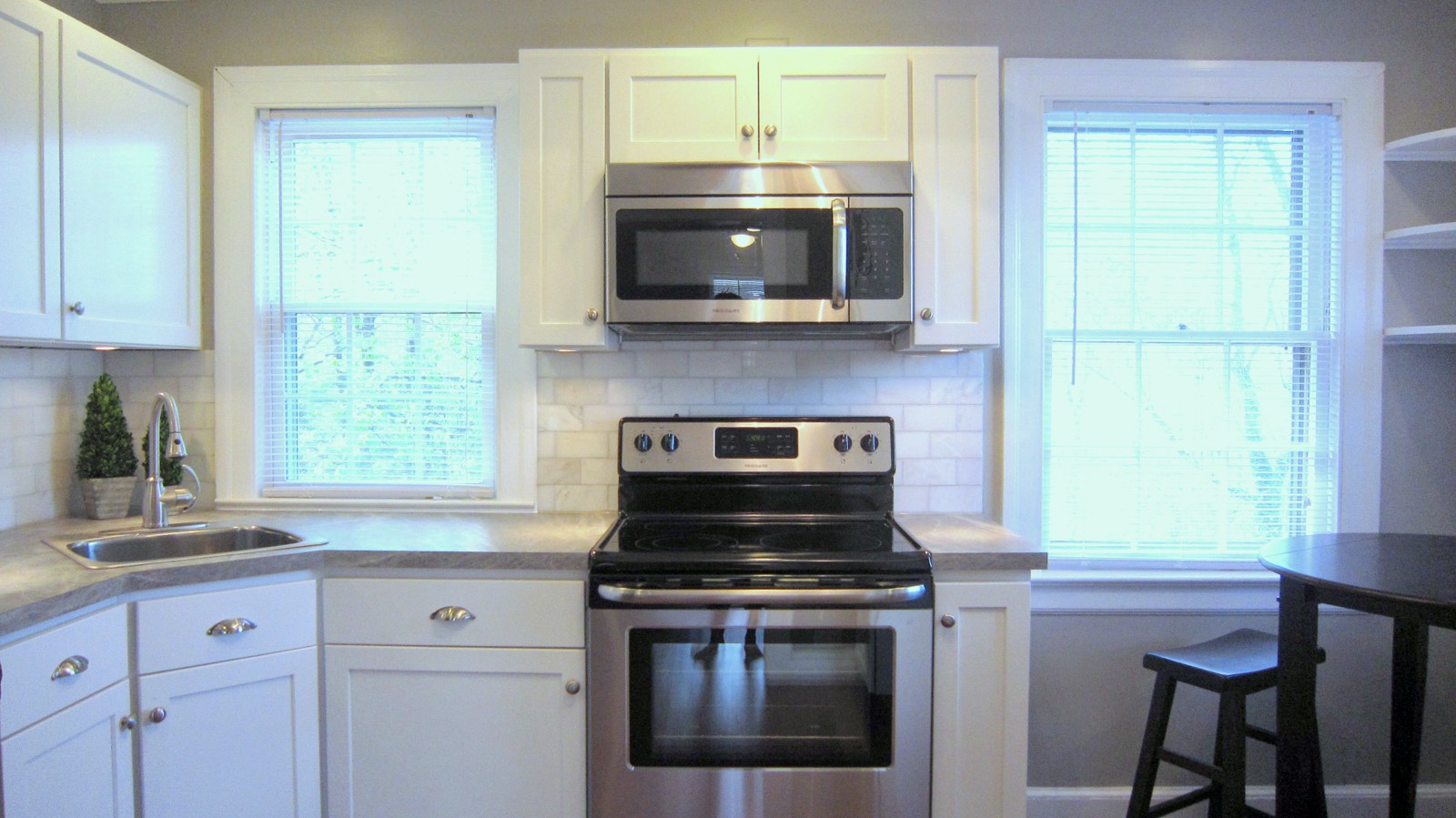
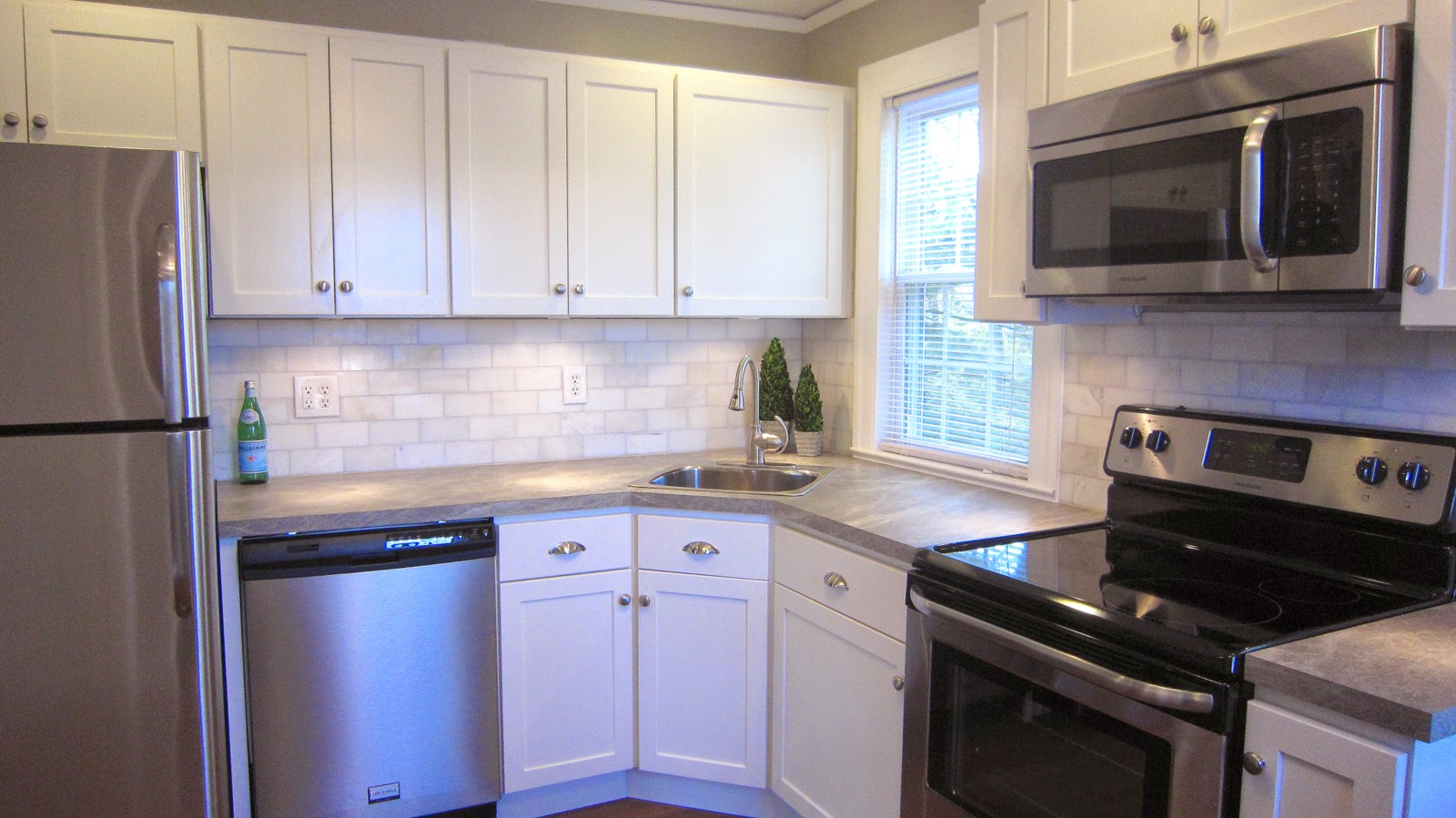
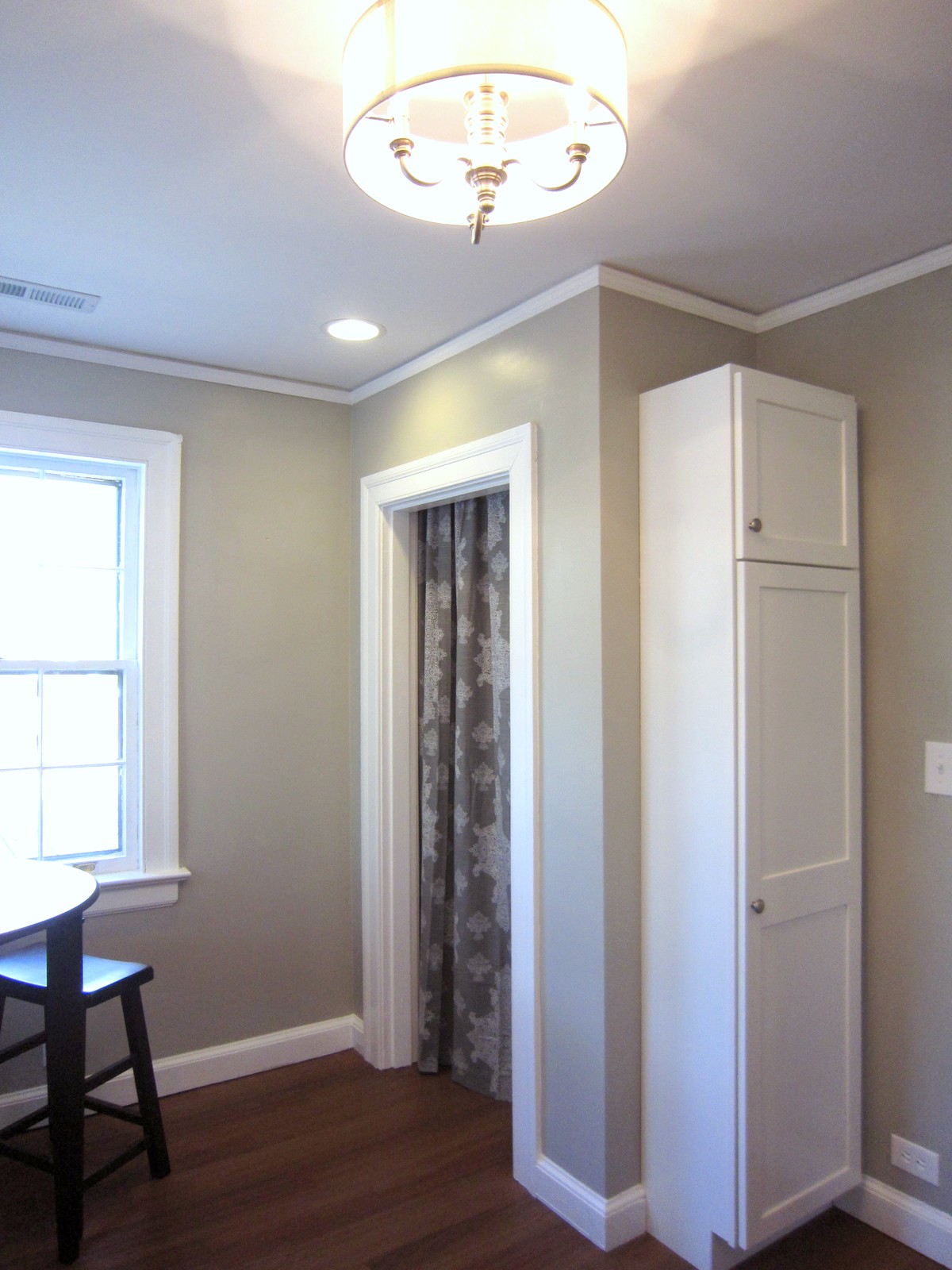
Maximum Potential and a Dishwasher! Relocating the kitchen’s entrance allowed us to maximize the kitchen’s layout and, by incorporating a corner sink, create space for a dishwasher! And we are nuts for storage, so we incorporated a closet pantry (with curtain closure rather than a space-hogging door), corner shelves, and a tall panty cabinet to maximize storage potential. There is even a sunlit corner that provides space for an eat-in kitchen area.
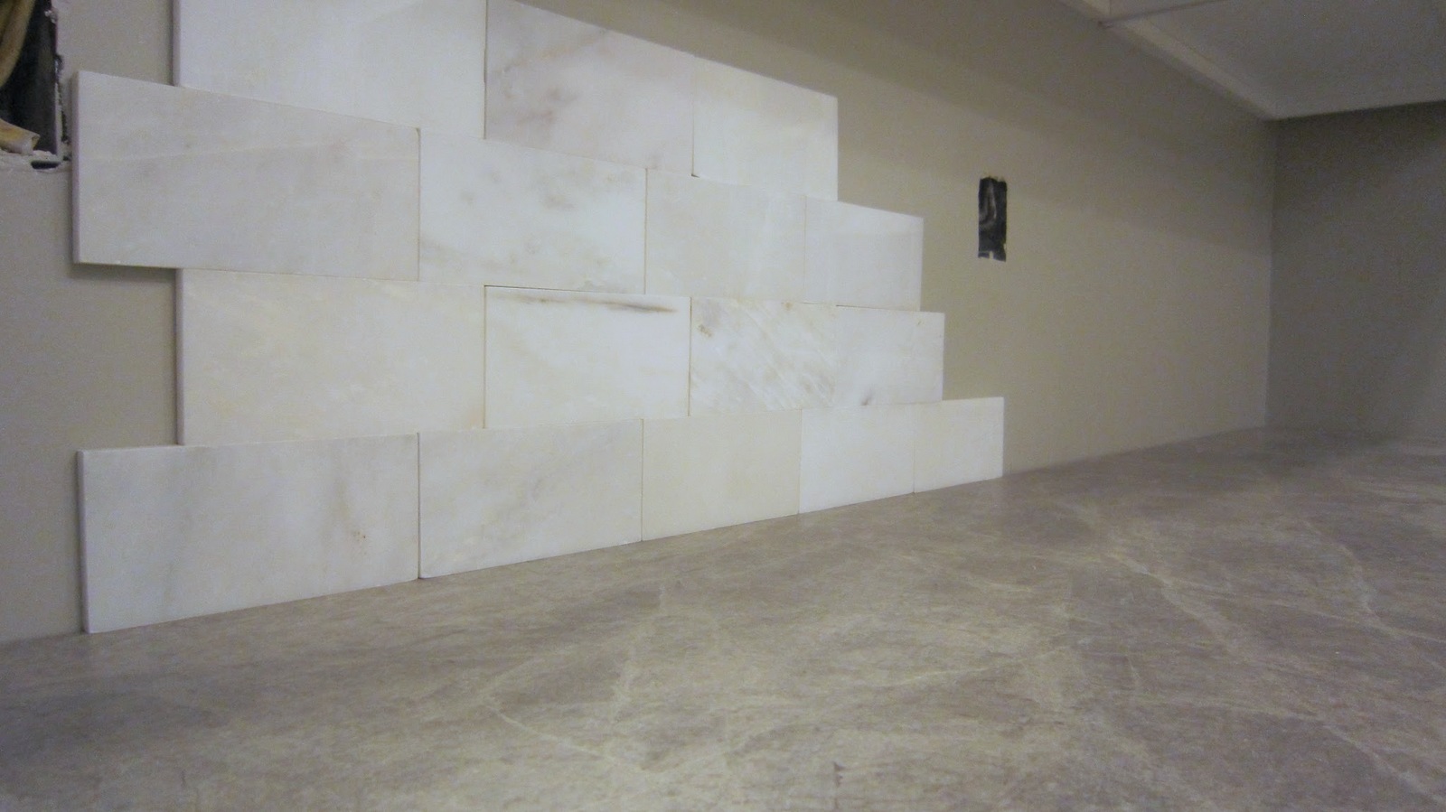
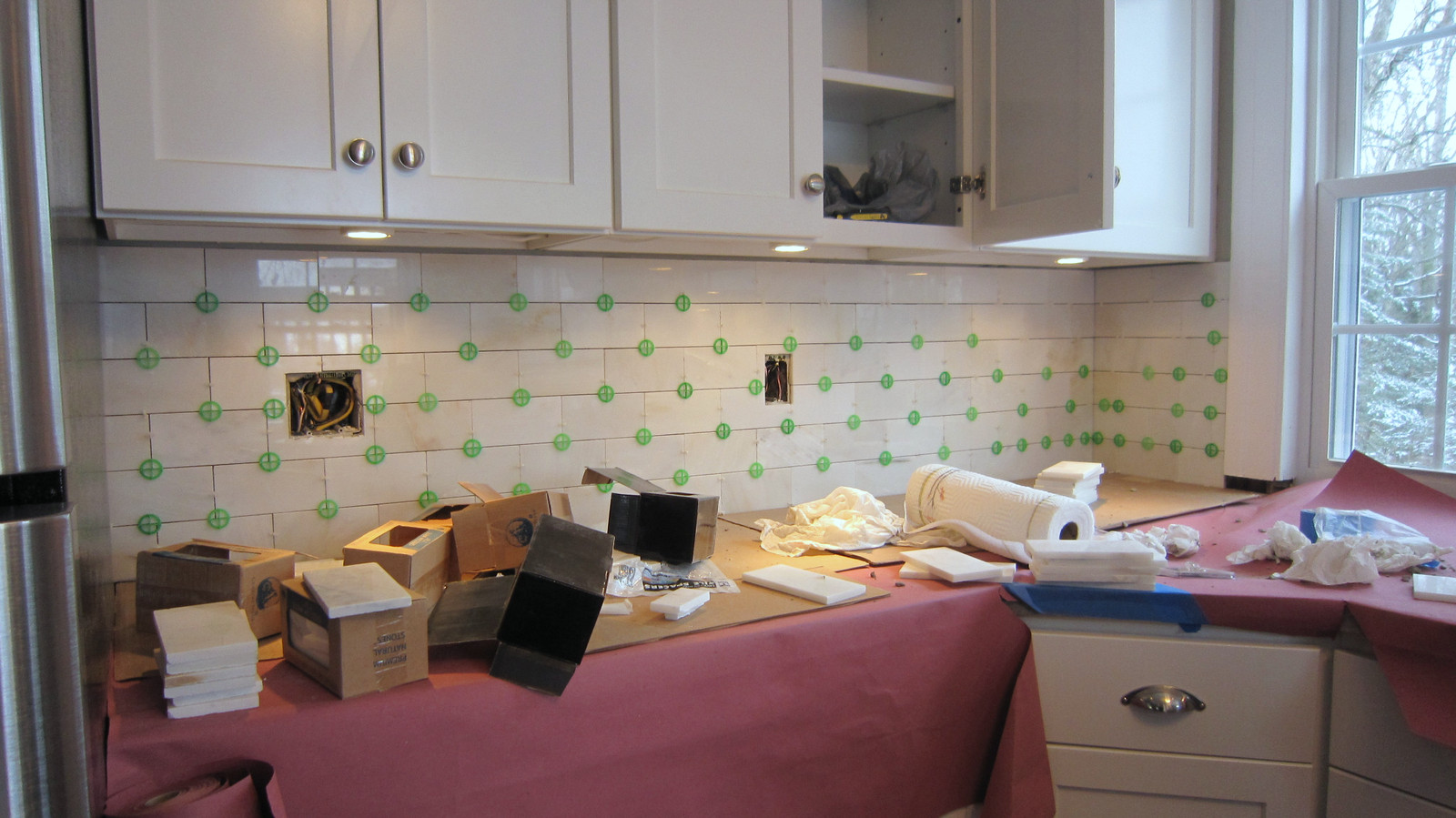
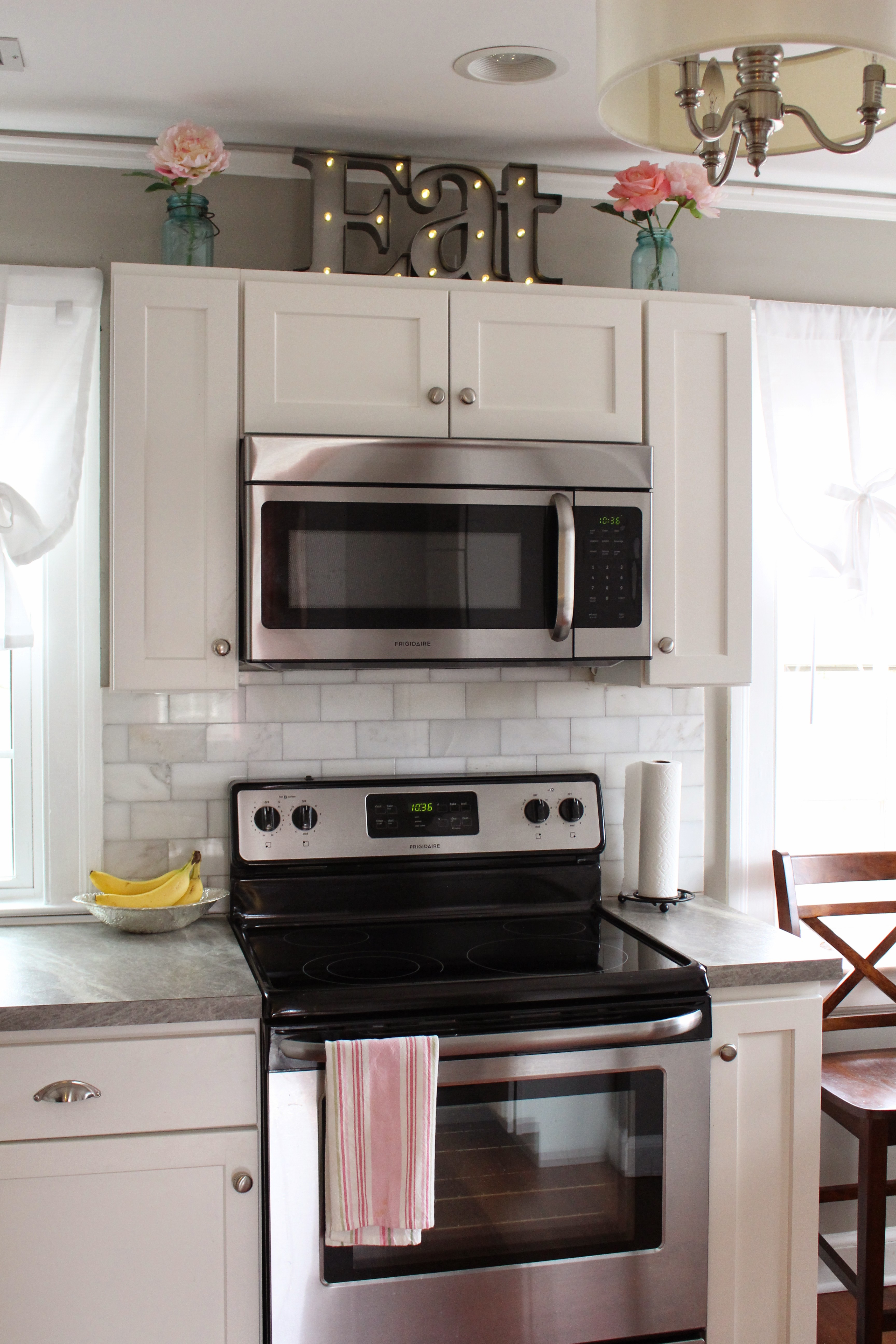
This isn’t your Grandma’s Formica. Laminate is back! This cost-conscious countertop option has made huge strides the last five years, and this Formica Soapstone Sequoia countertop pairs oh-so-nicely with 3×5 white marble backsplash tiles. I love, love, love how this cost-effective combo pulls off a high-end look!
**A Must-Do to give laminate a high-end look: Eliminate the dated 4″ molded backsplash and instead install a tile backsplash.**
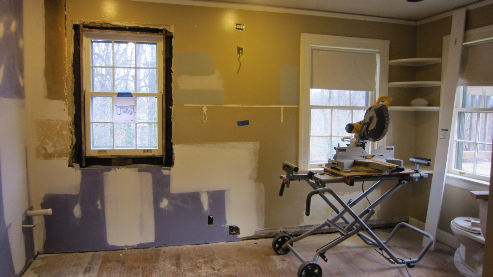
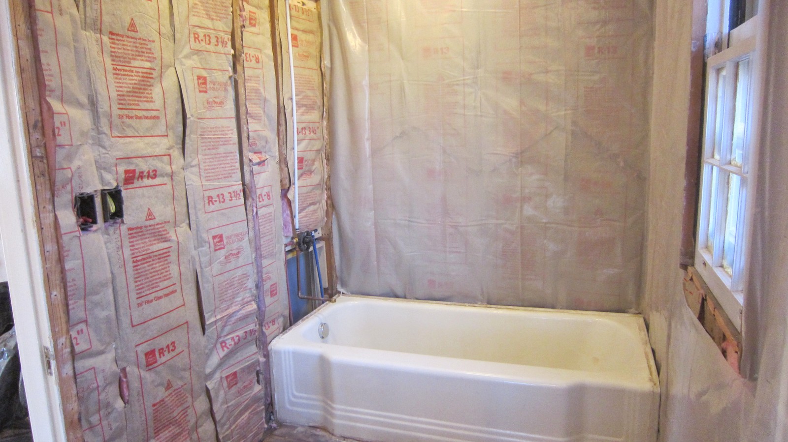
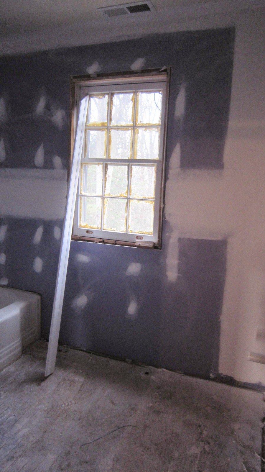
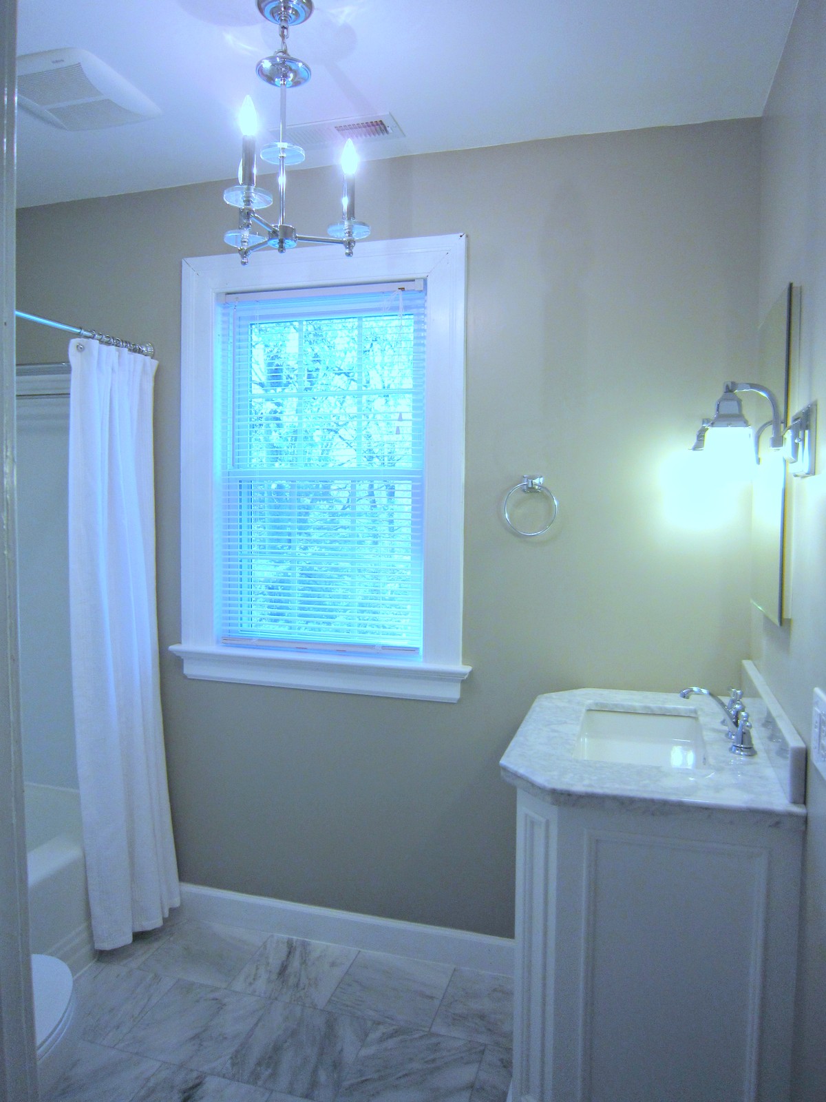
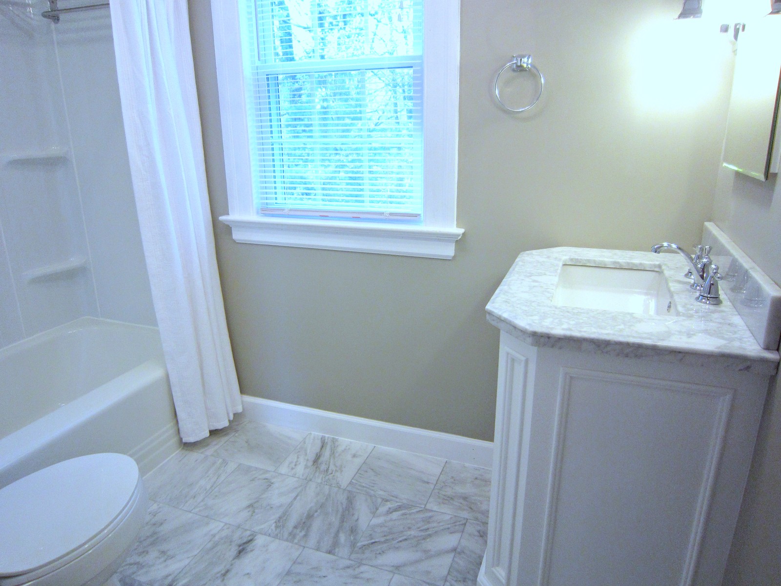
Starting Fresh & Keeping Things Quiet. We kept the gorgeous, original cast iron tub and had it professionally sprayed, but everything else had to go. With the pink tile gone and the bathroom walls gutted, we took the opportunity to insulate the bath — because a little bathroom soundproofing never hurts. Then we drywalled the room with “blue board” (waterproof sheetrock) and replaced that old window.
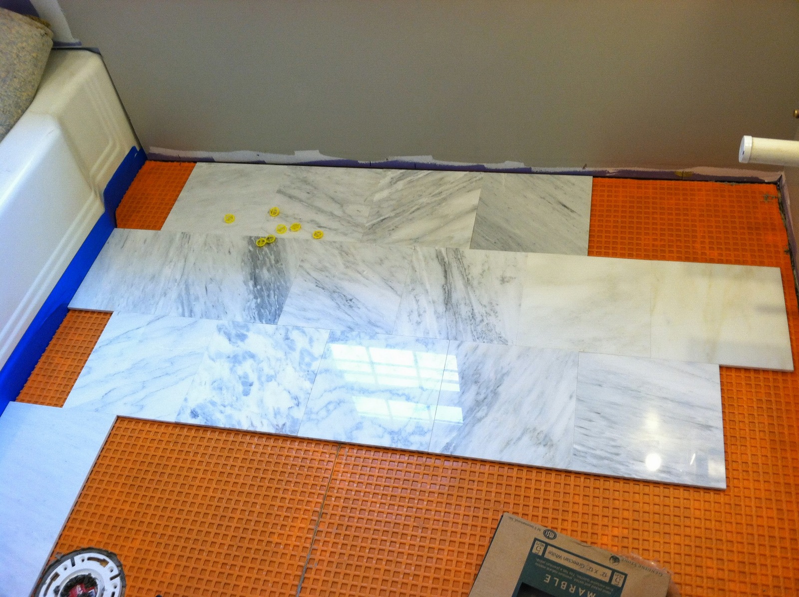
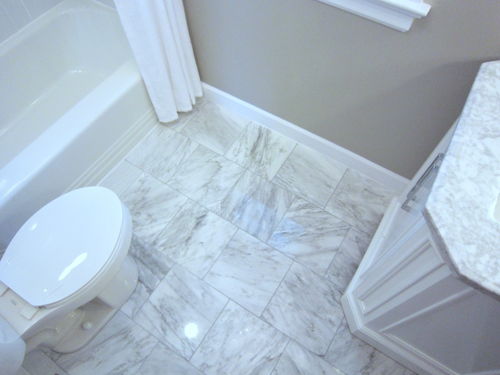
We installed new cement board on the floor and then prepped the floor for tile with DitraMat. We chose 12×12 polished marble tiles that speak to the vintage of the home but also beautifully bounce-back the light from the new chandelier, making the bathroom feel larger and even brighter.
THE AFTER
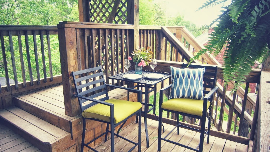
That view! I wasn’t kidding about the deck (off the living room). Look at how cute, and it offers views of the ravine and entire neighborhood! It’s the ultimate spot to perch in the morning, watch the sunrise, grab your laptop, and drink a cup of coffee.
A view for all seasons!
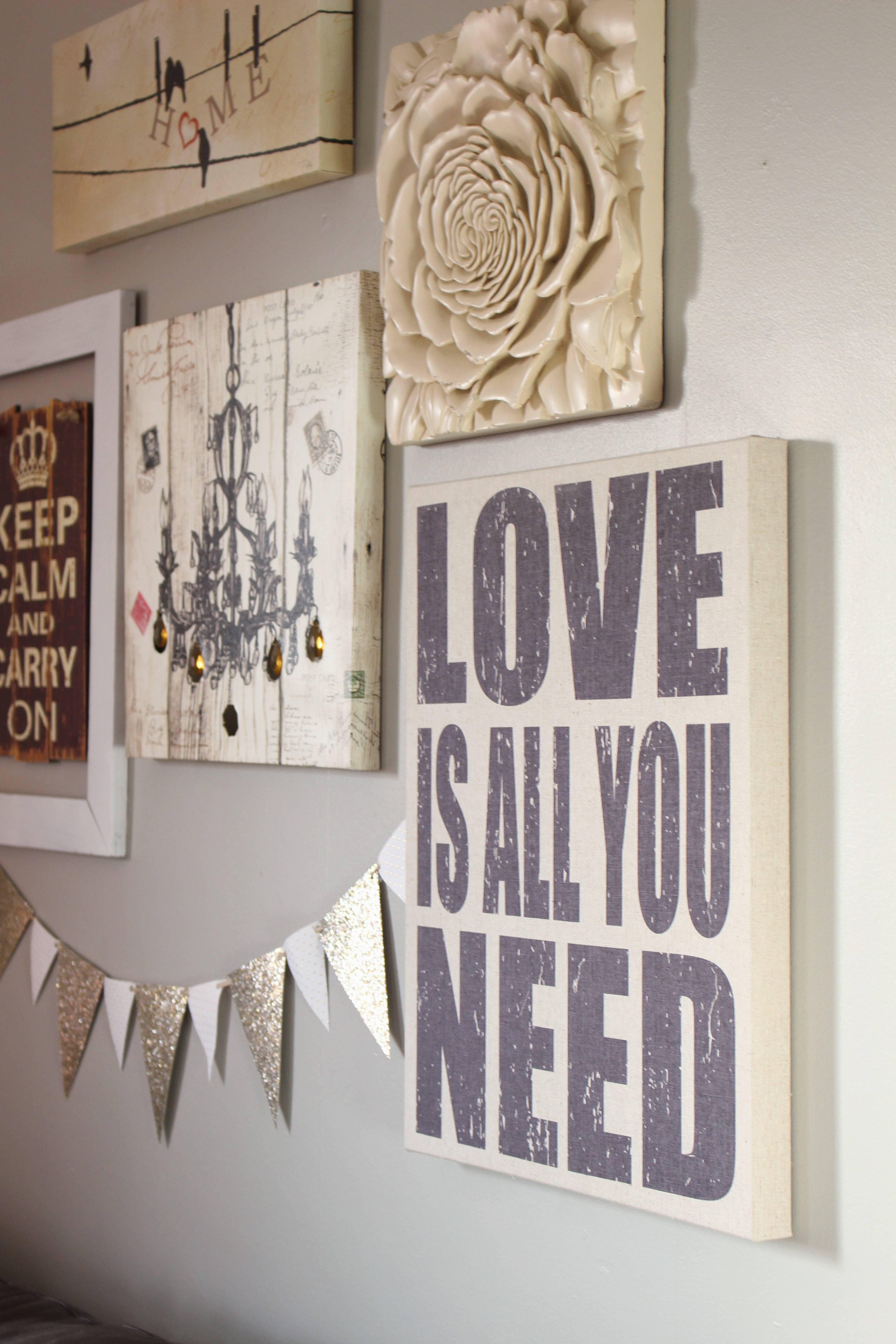
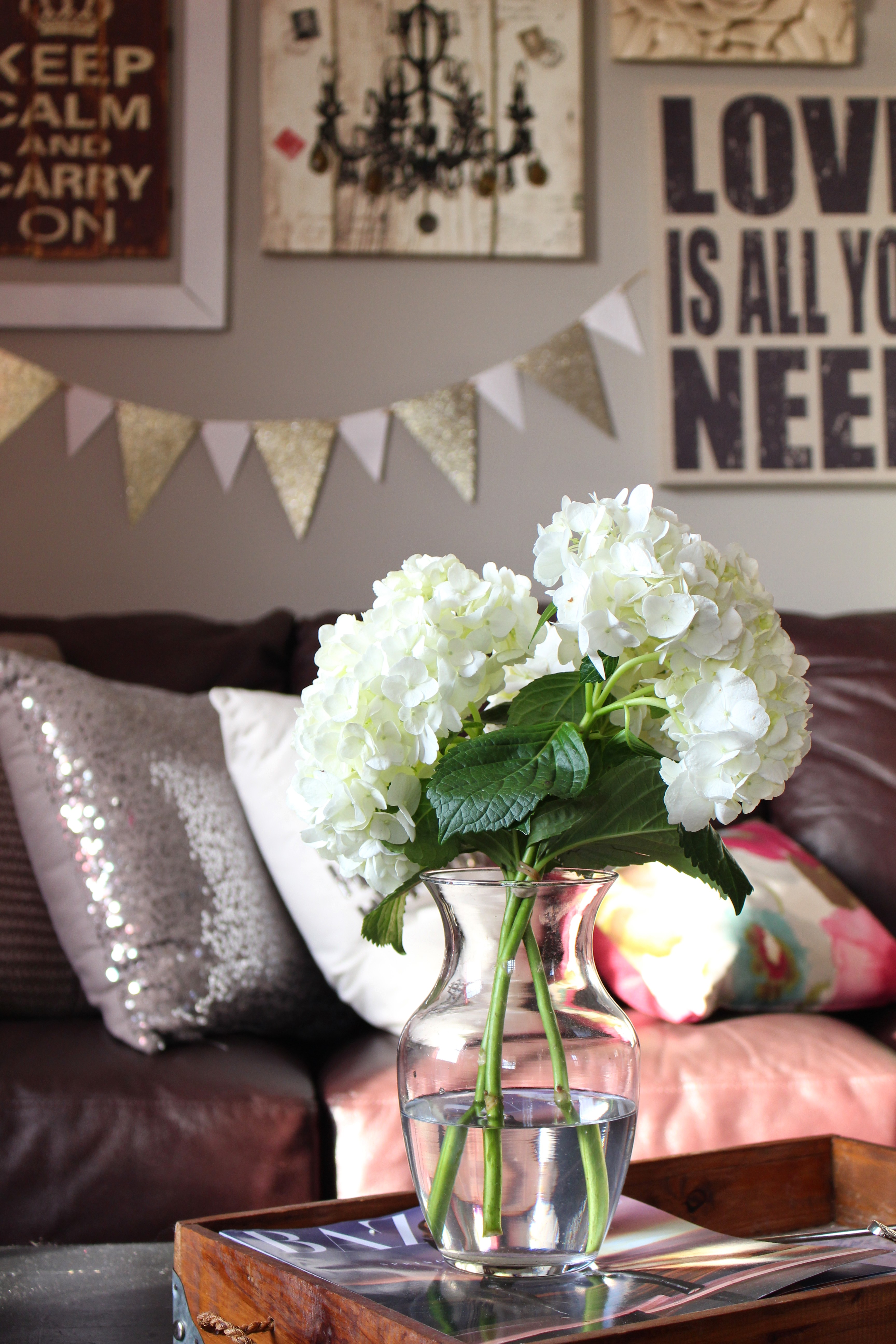
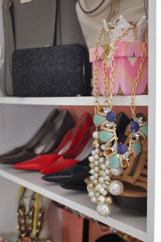
The Colonial’s 3,000 sq ft, 18-month renovation was an exhausting labor of love. We tackled most of the renovations ourselves and lived in the house throughout the process (sigh), but we are so incredibly blessed that our hard work paid off and brought us the kindest, most thoughtful tenants who have truly loved and cared for the home and made it their own. A few months back I did a photo shoot with the “treehouse” apartment tenant – the incredibly talented Miss Katie. The girl is a decorating genius! She has decorated the “treehouse” apartment top to bottom and created a stunning home, and all on a Craigslist-style budget! We sat down for wine, an interview, loads of laugh, and her inspiring tips for achieving beautiful design on a shoestring budget. You’ll be blown away by her resourceful designs and gorgeous style! I’ll be back tomorrow with the photos and interview, but in the meantime, here are a few sneak peeks!!
So good, right?! Swing by tomorrow to see the rest of the apartment!



I’m impressed that those are laminate countertops. Wouldn’t have known if you hadn’t said they were! I guess in my mind I always see laminate with the goofy edge you mentioned. Much better without it!
Hi Sharon, thank you and agreed!! Though ironically you pay more to eliminate that goofy 4″ backsplash and cheesey rounded profile, but still worth it!