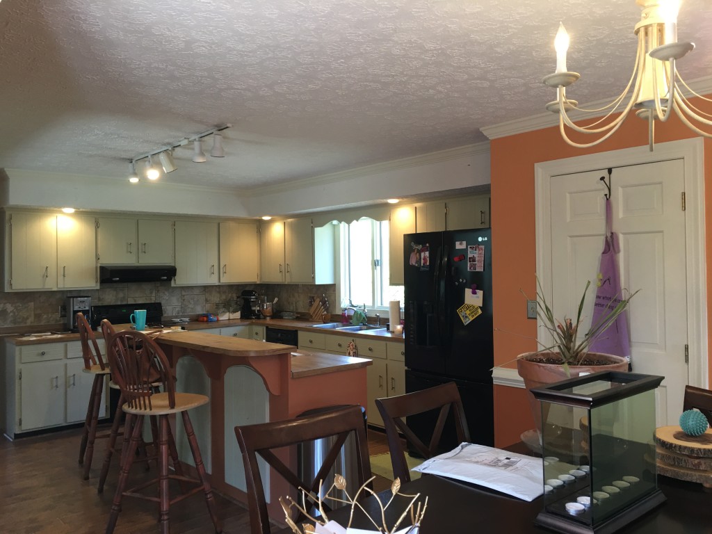
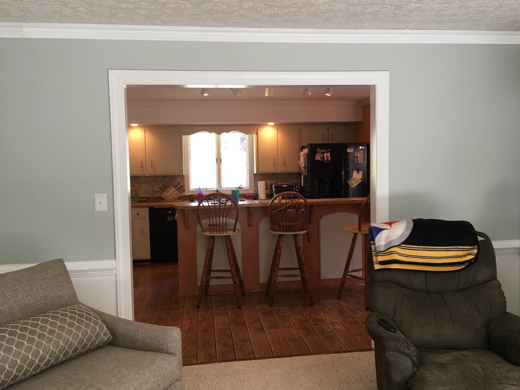
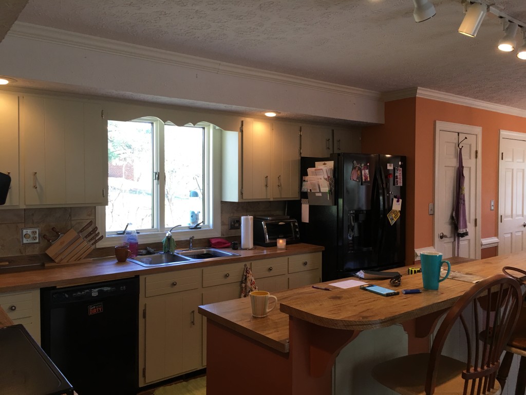
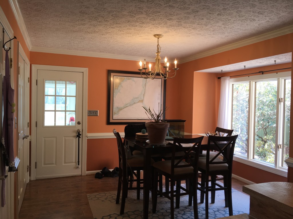
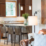
Our clients knew when they bought the house it was destined for a facelift, but this talented couple had incredible vision! The things they didn’t like about the house could be changed. Like this kitchen and dining area, which were itching for a renovation.
We were excited to partner with them in making this home one they love! First things first, this 1960’s house felt closed off. The kitchen appeared small given the home’s overall square footage. So we widened the opening between living room and kitchen. Then it was time to get to work on those dated ceilings and awkward soffits. Next went the old cabinets and the home’s mismatched floors. And in their place were installed custom kitchen cabinets and new white-washed oak flooring throughout the home.

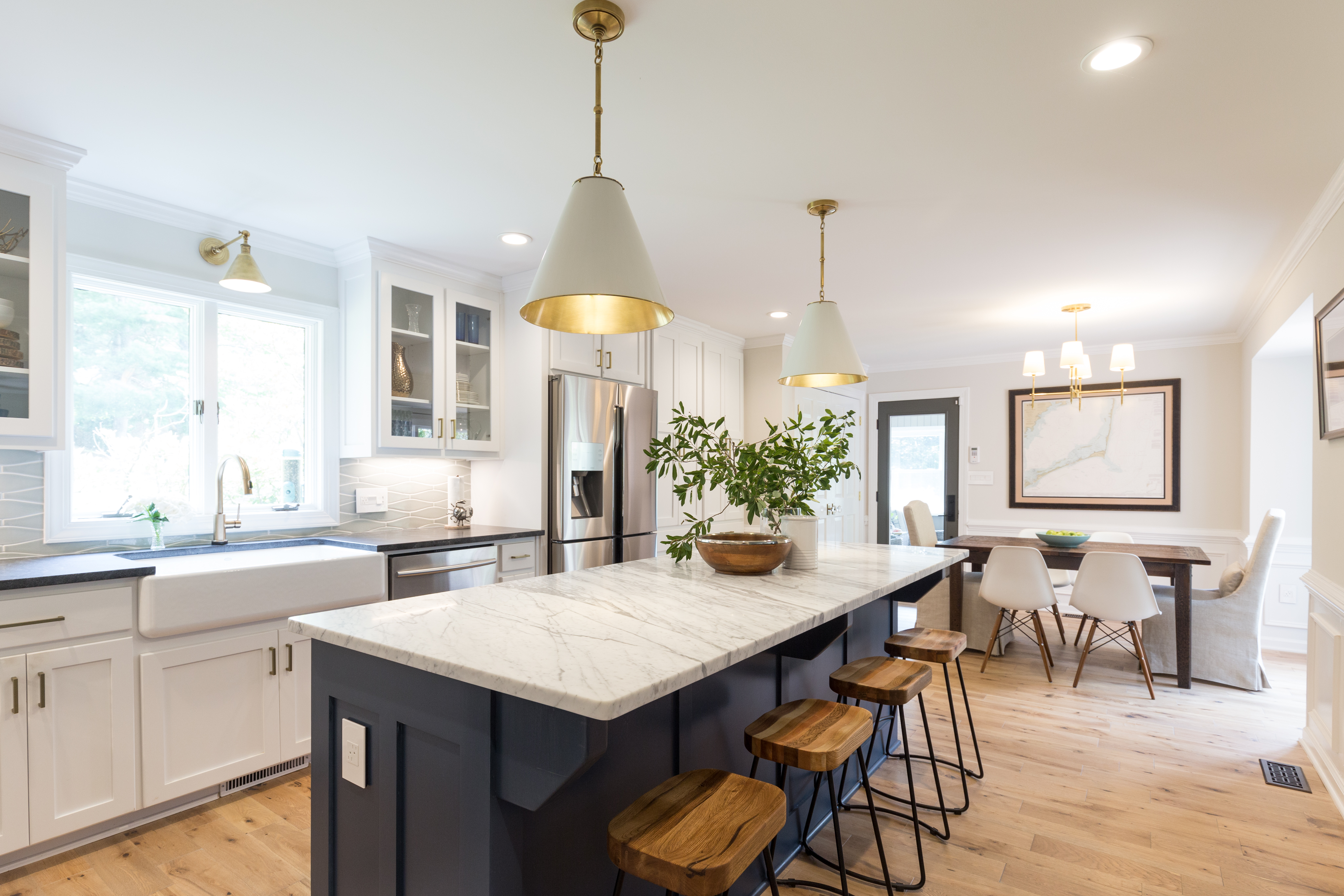
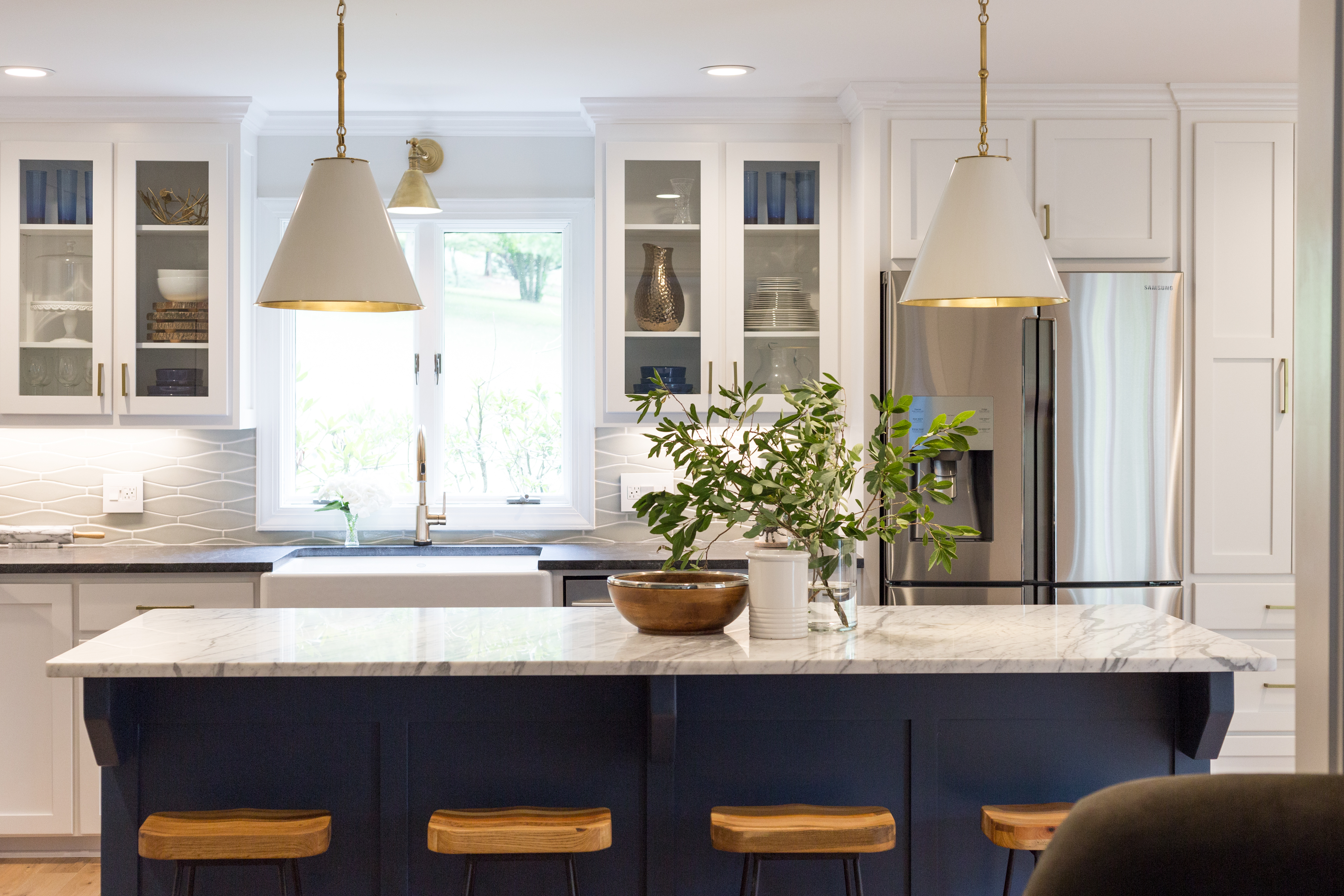
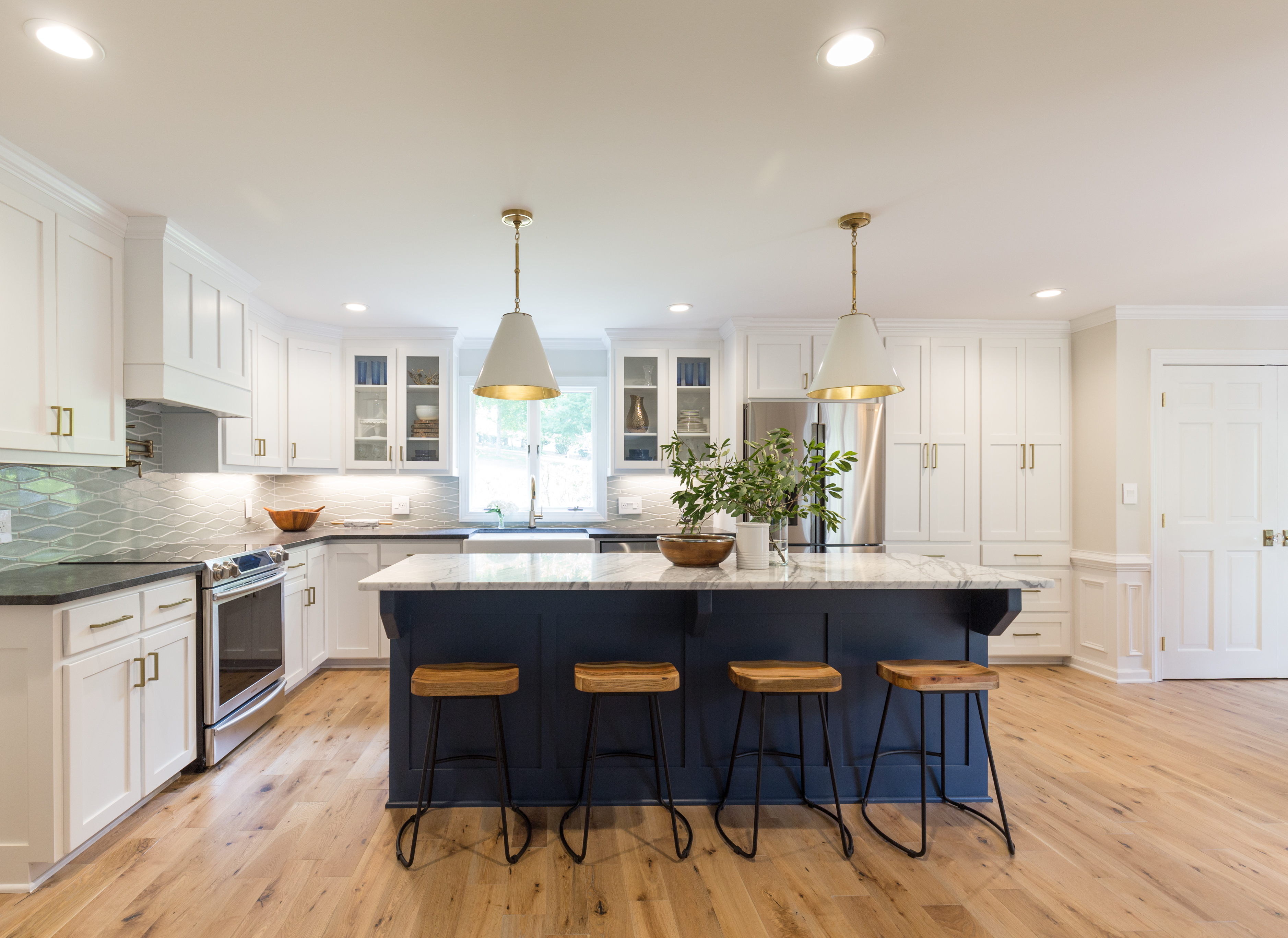
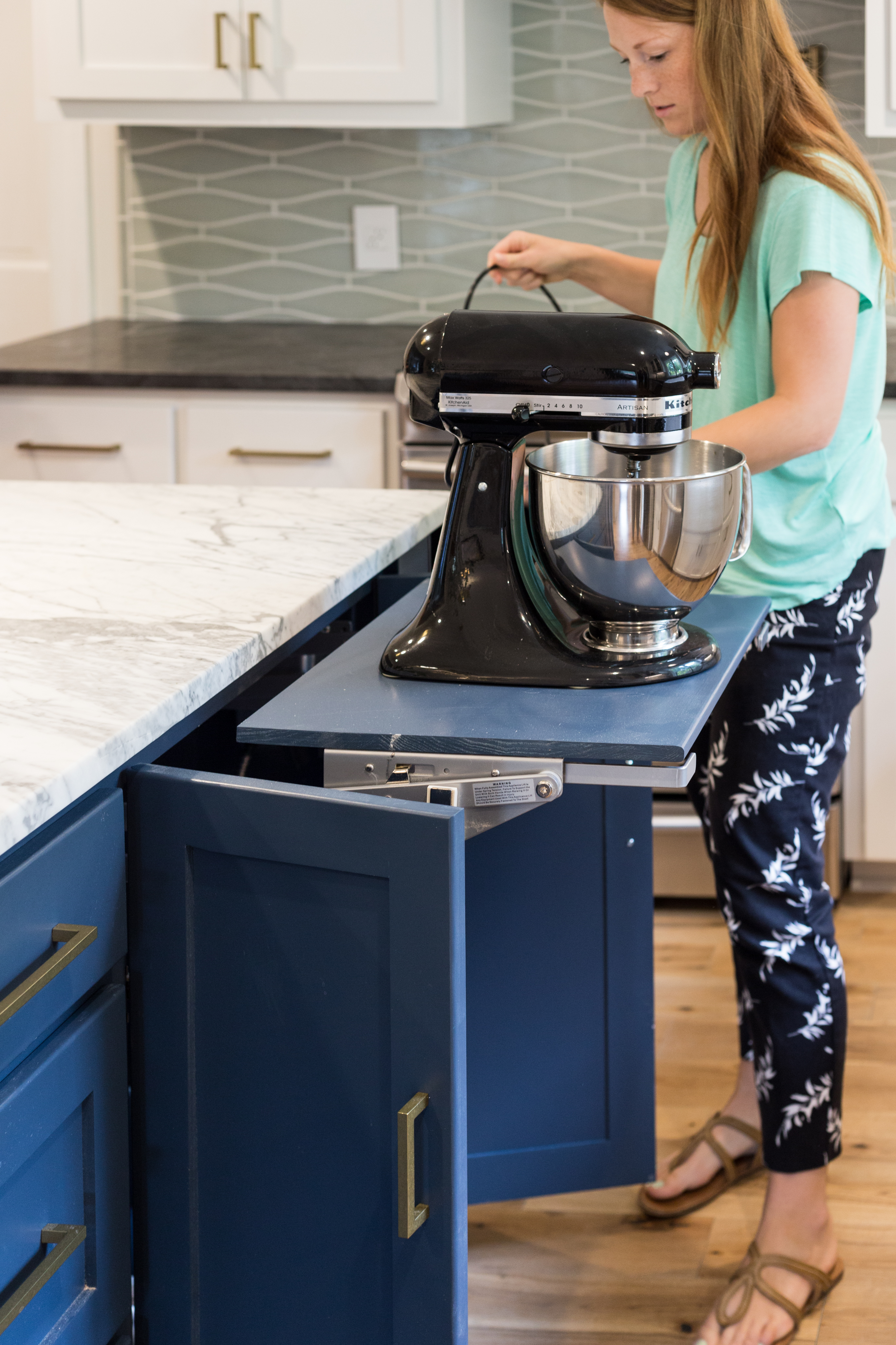
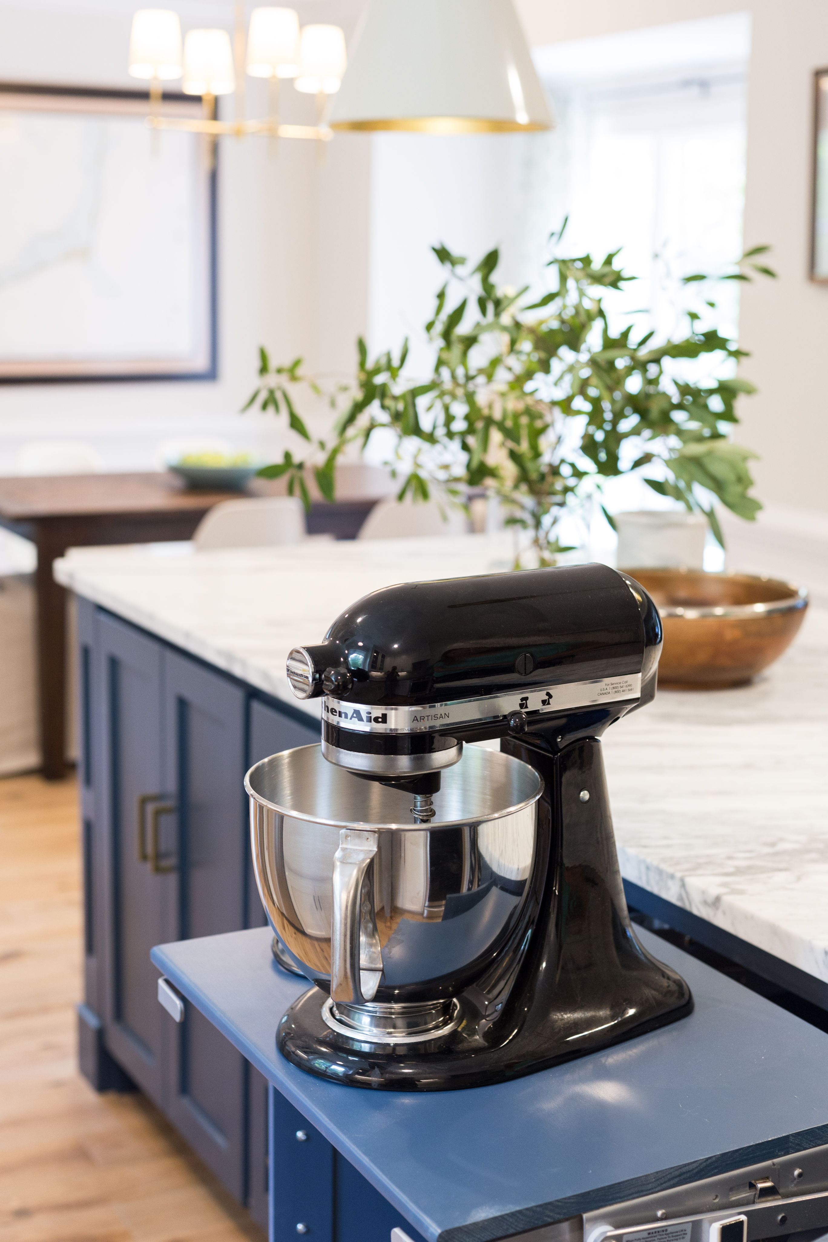
The awkward closet-style pantry was eliminated in favor of additional cabinetry, making the kitchen feel larger. Behind those pantry cabinet doors you’ll find pull-out drawers and outlets to provide an out-of-sight place for the microwave and coffee pot. The Kitchen Aid mixer has its own spot too!
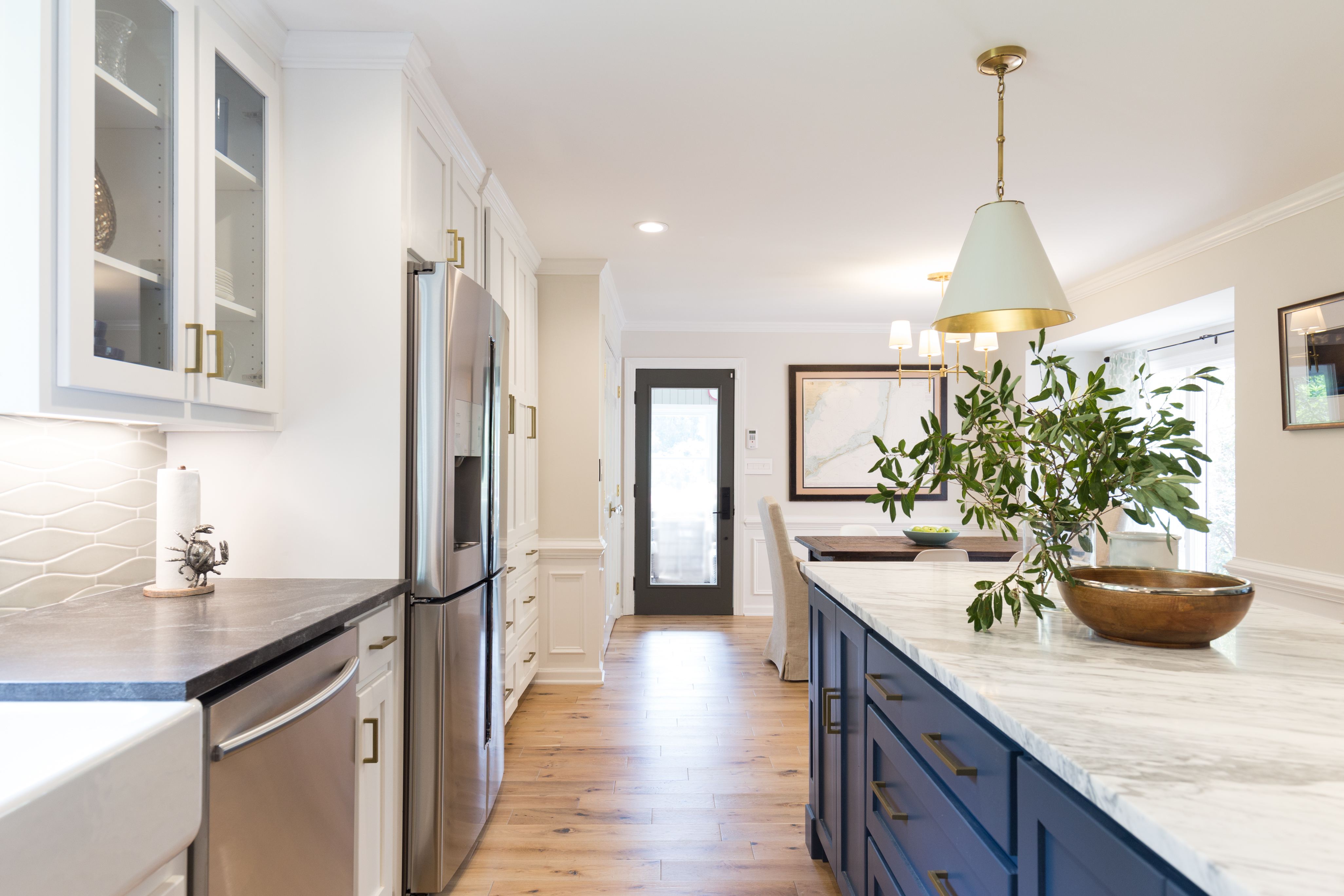
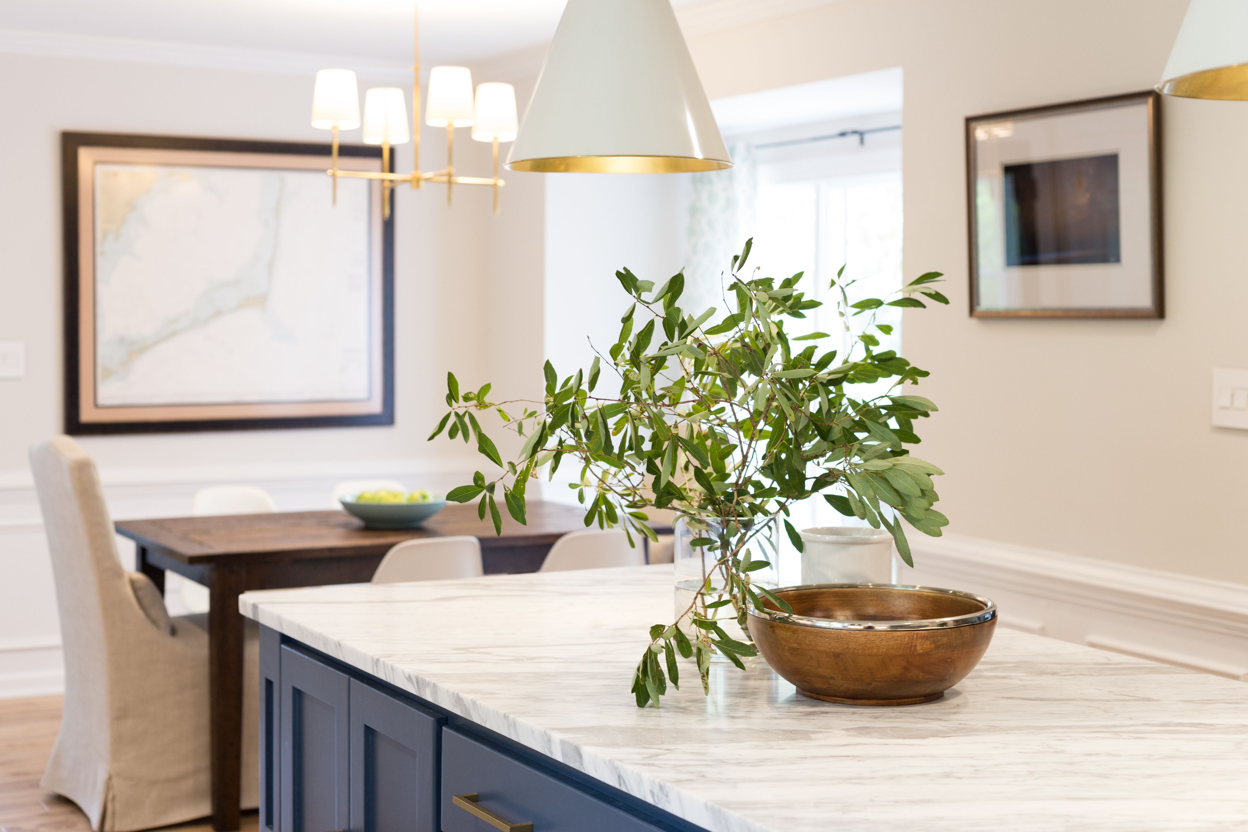
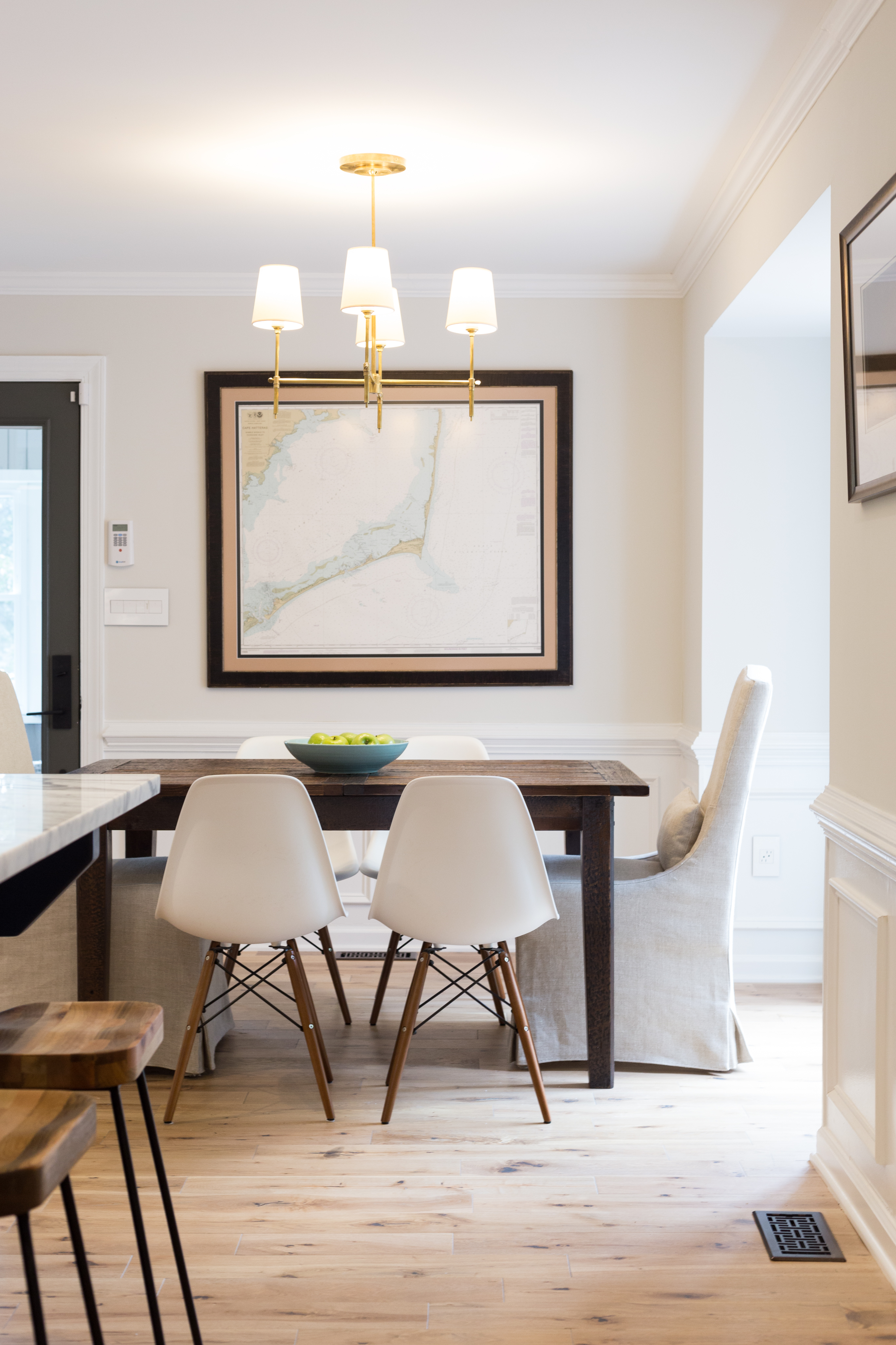
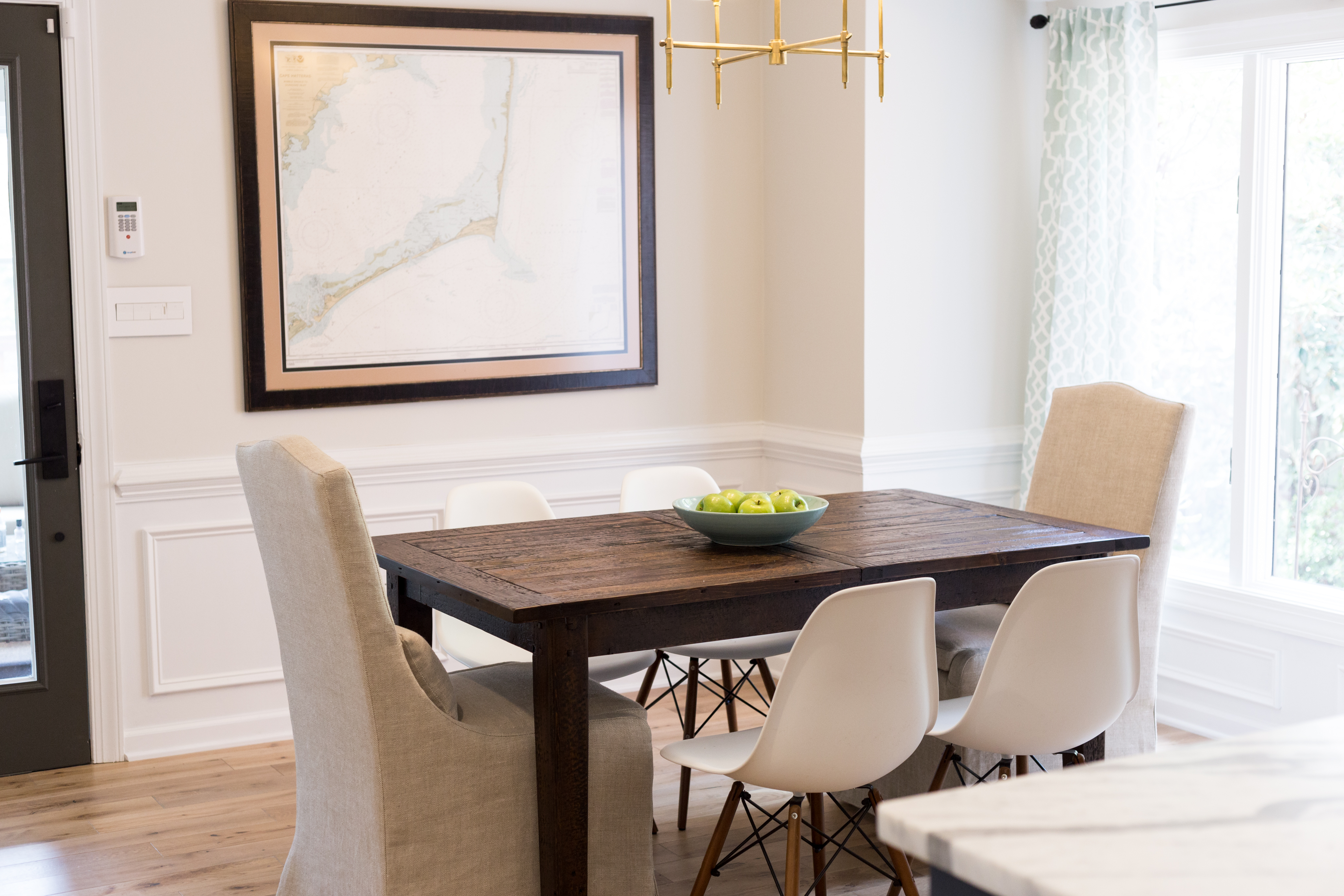
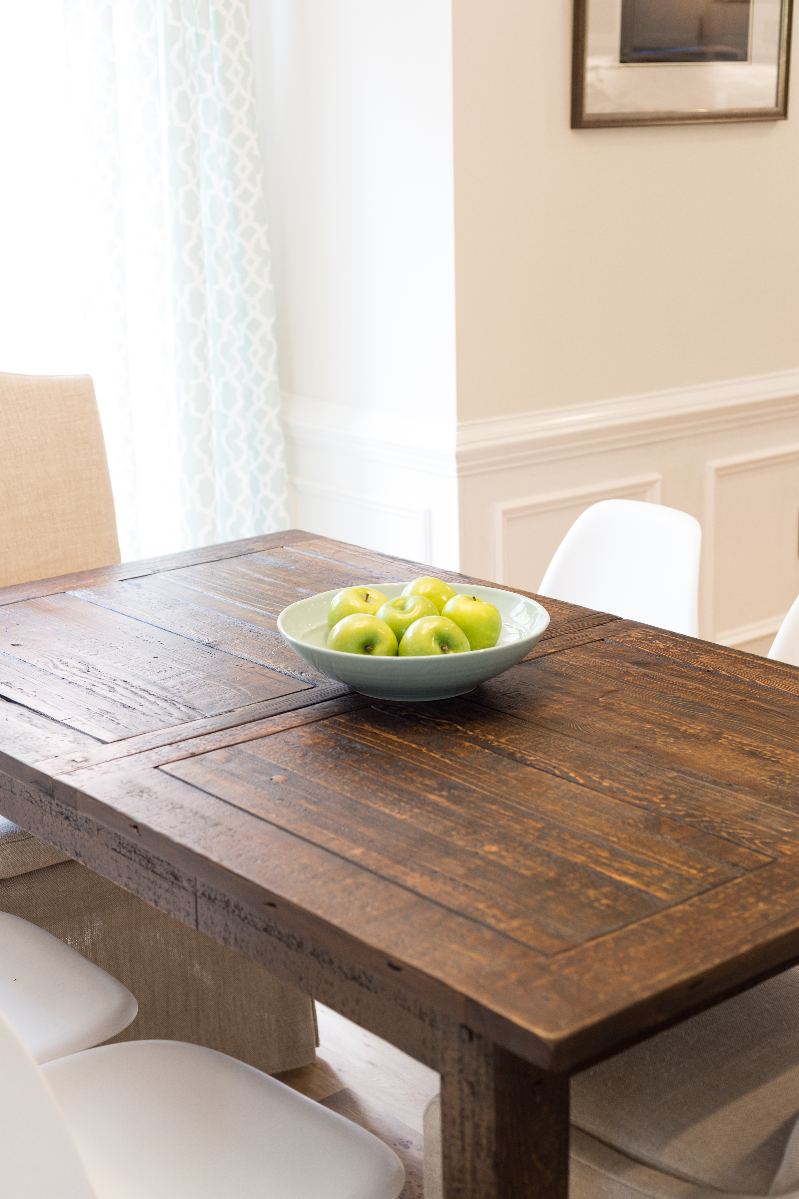
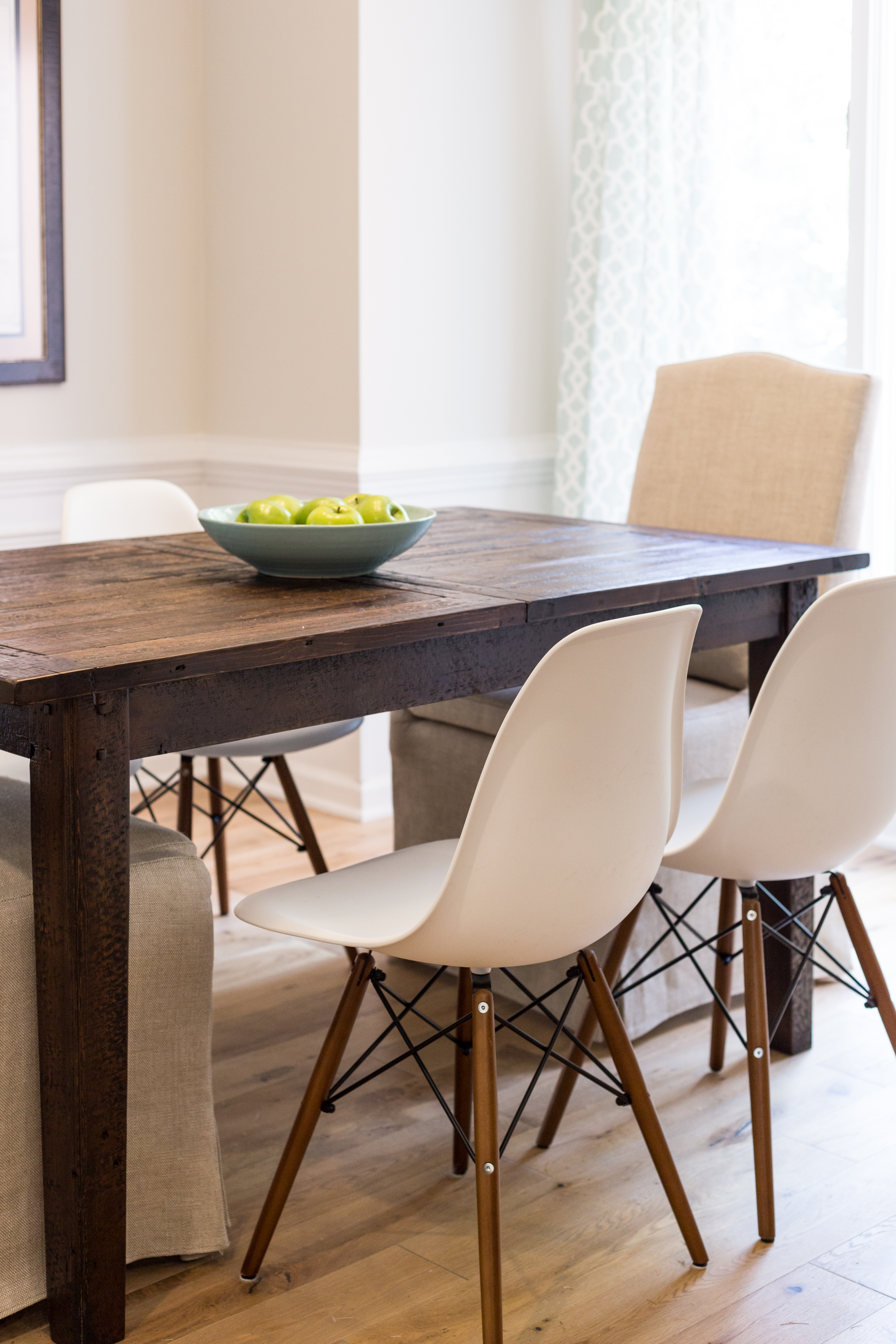
When it came to the dining area, we kept things simple with a focus on clean lines and contrast. The side chairs are easily wiped down if any visiting kiddos get messy, but they are comfortable for adults too! The slipcovered, linen captain’s chairs add texture and height. And the pretty framed map and photography print give nod to the clients’ honeymoon in the Outer Banks. Light fixtures are from Circa Lighting.
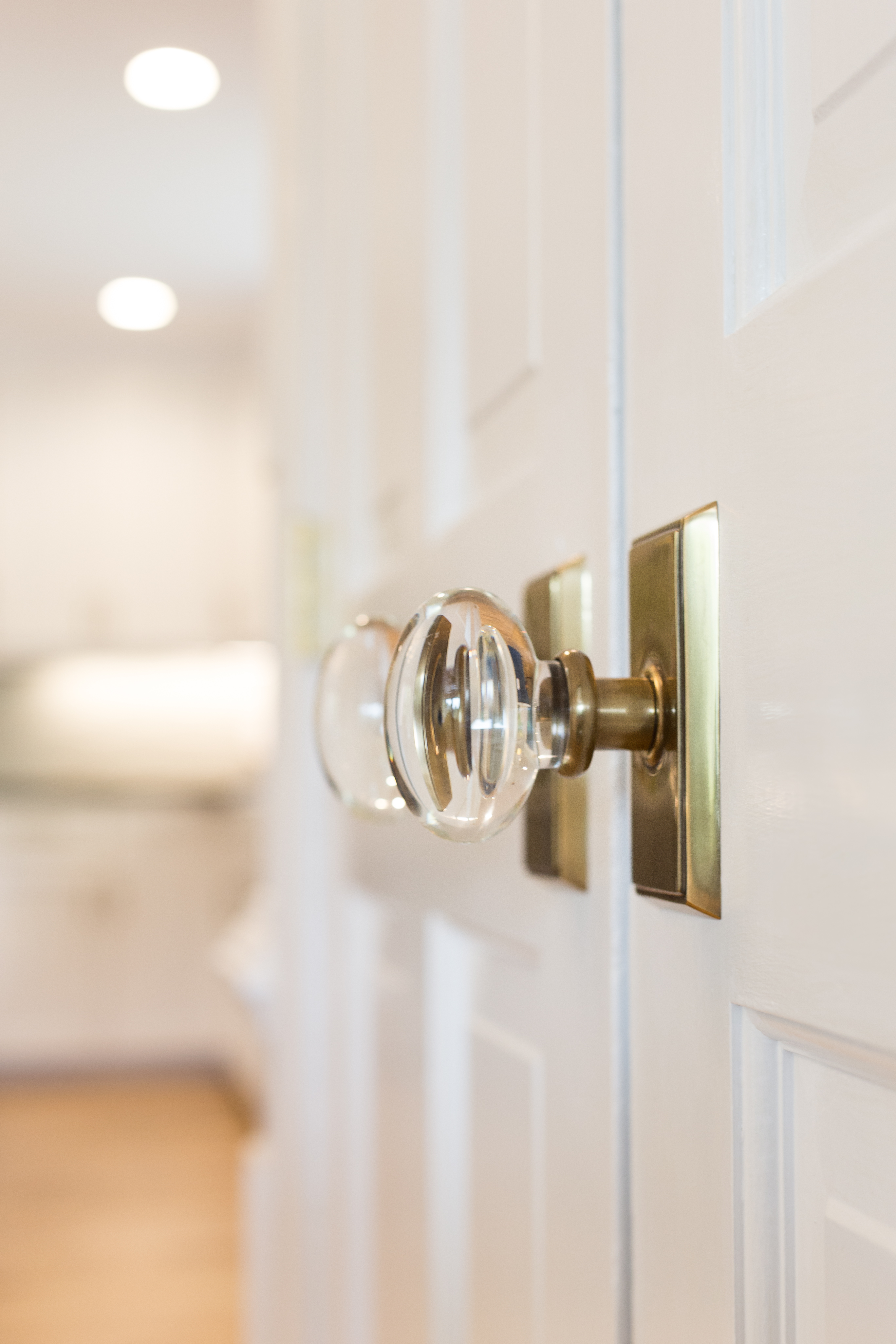
These pretty Emtek door knobs lead to the laundry.
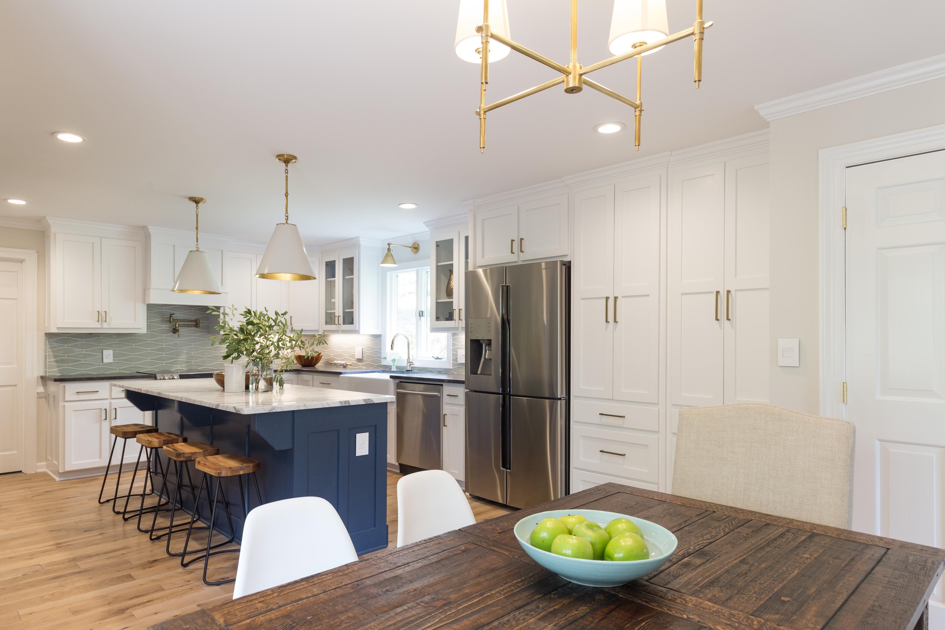
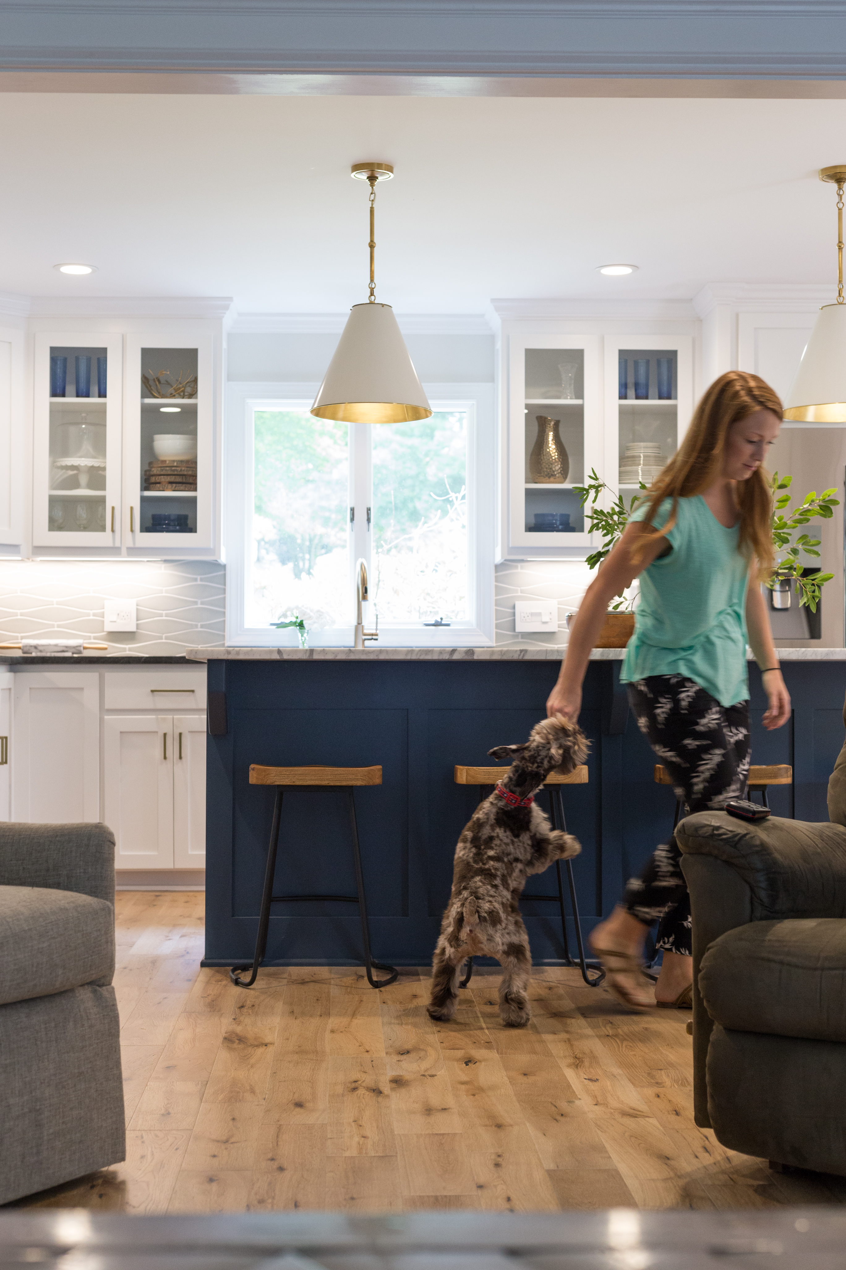
The widened entry between the kitchen and living room brings a modern sense of open-concept to the home’s floor plan. While the chair rail, crown, and new wainscoting embrace the home’s traditional style.
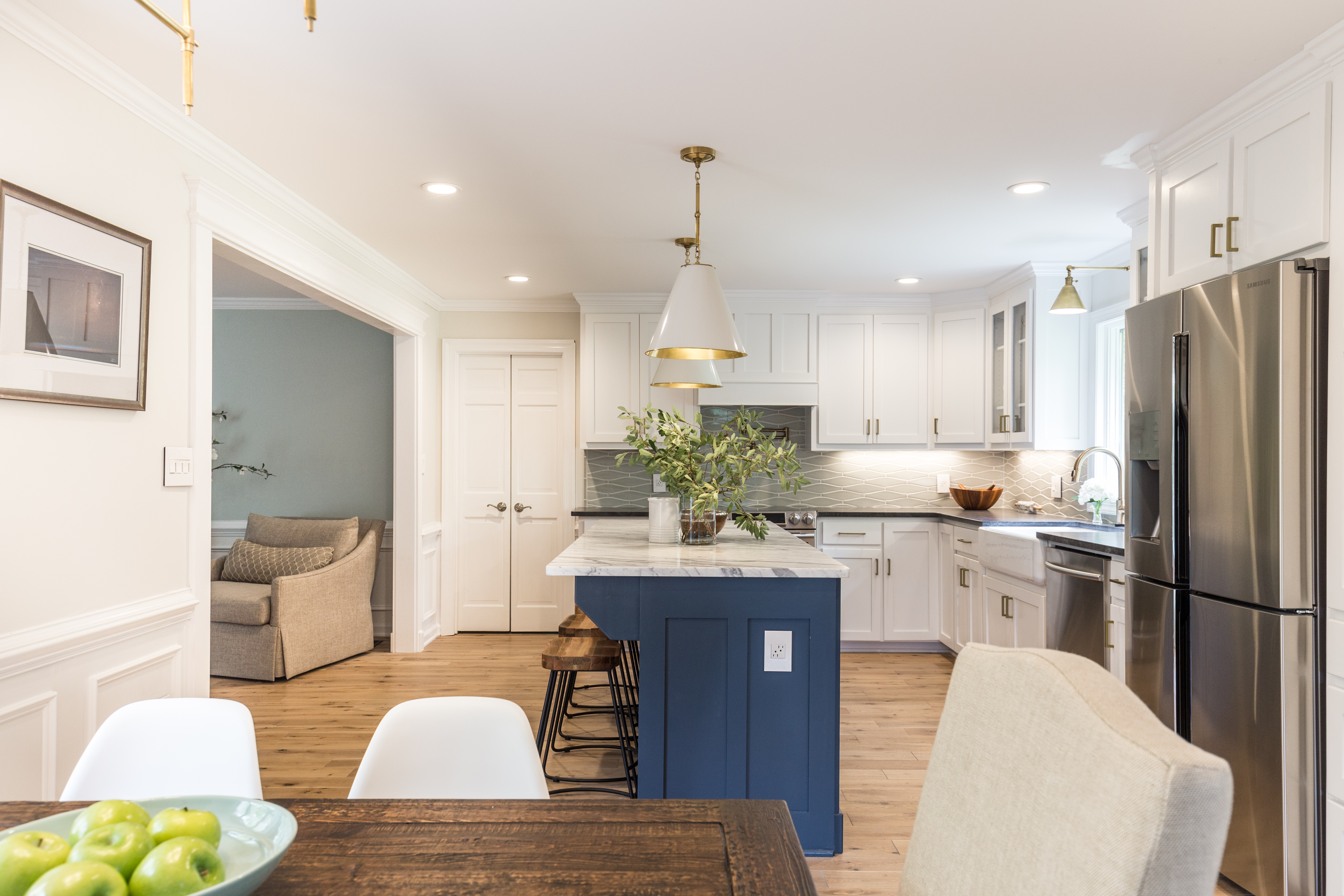
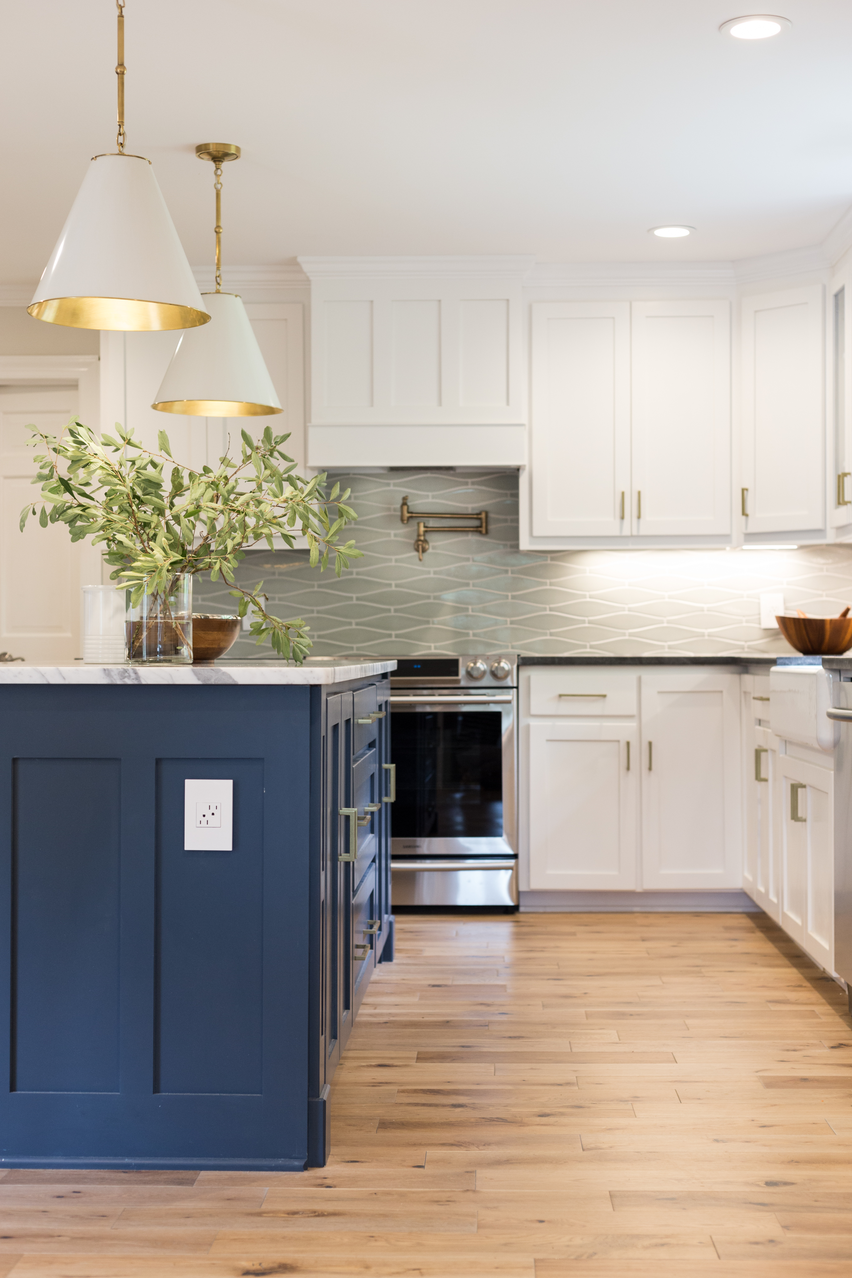
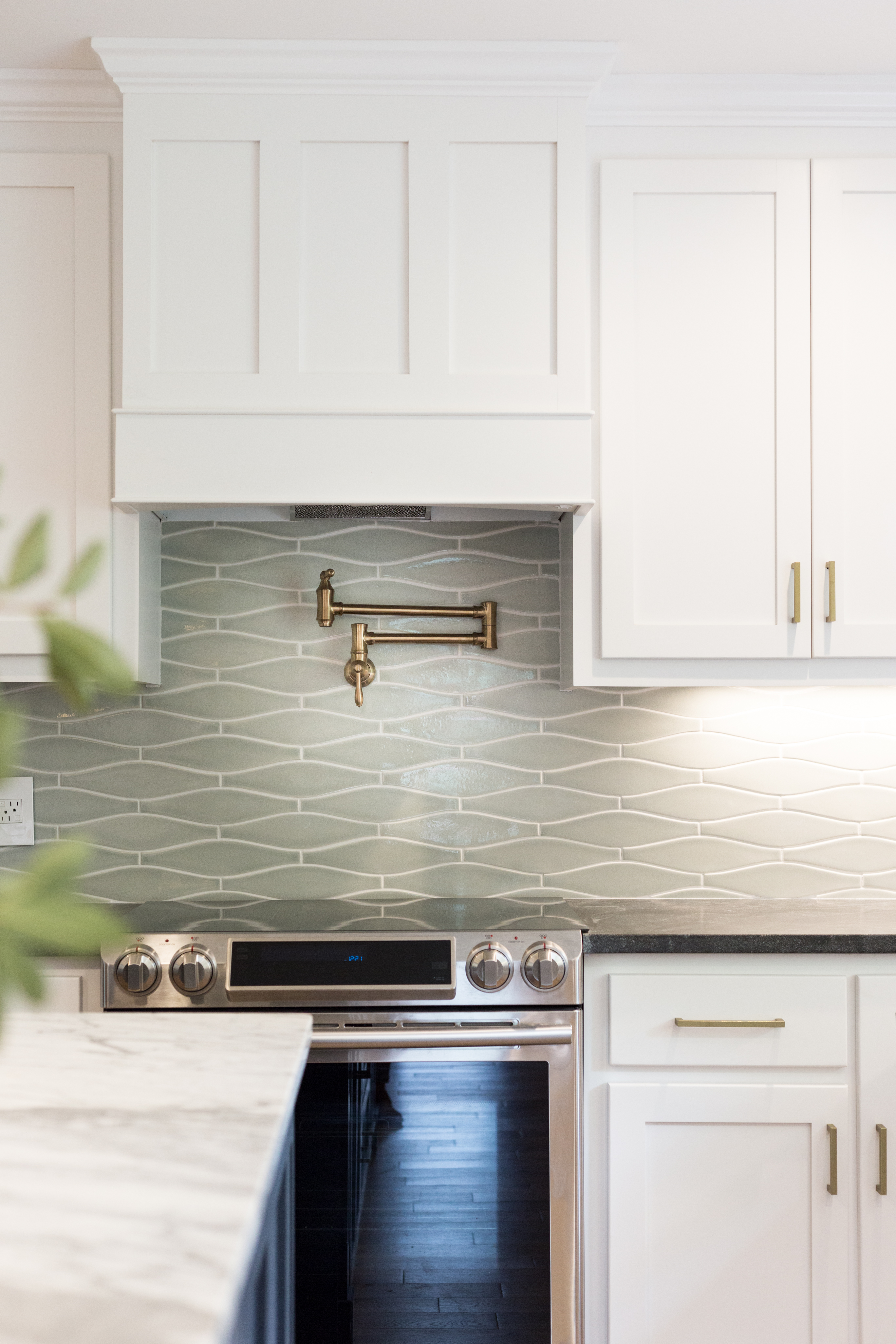
The mix of metals and wood tones throughout the space keep the feeling casual. And the gray-green of the backsplash tile and saturated navy blue on the island (Benjamin Moore’s “Washington Blue”) liven the otherwise neutral space.
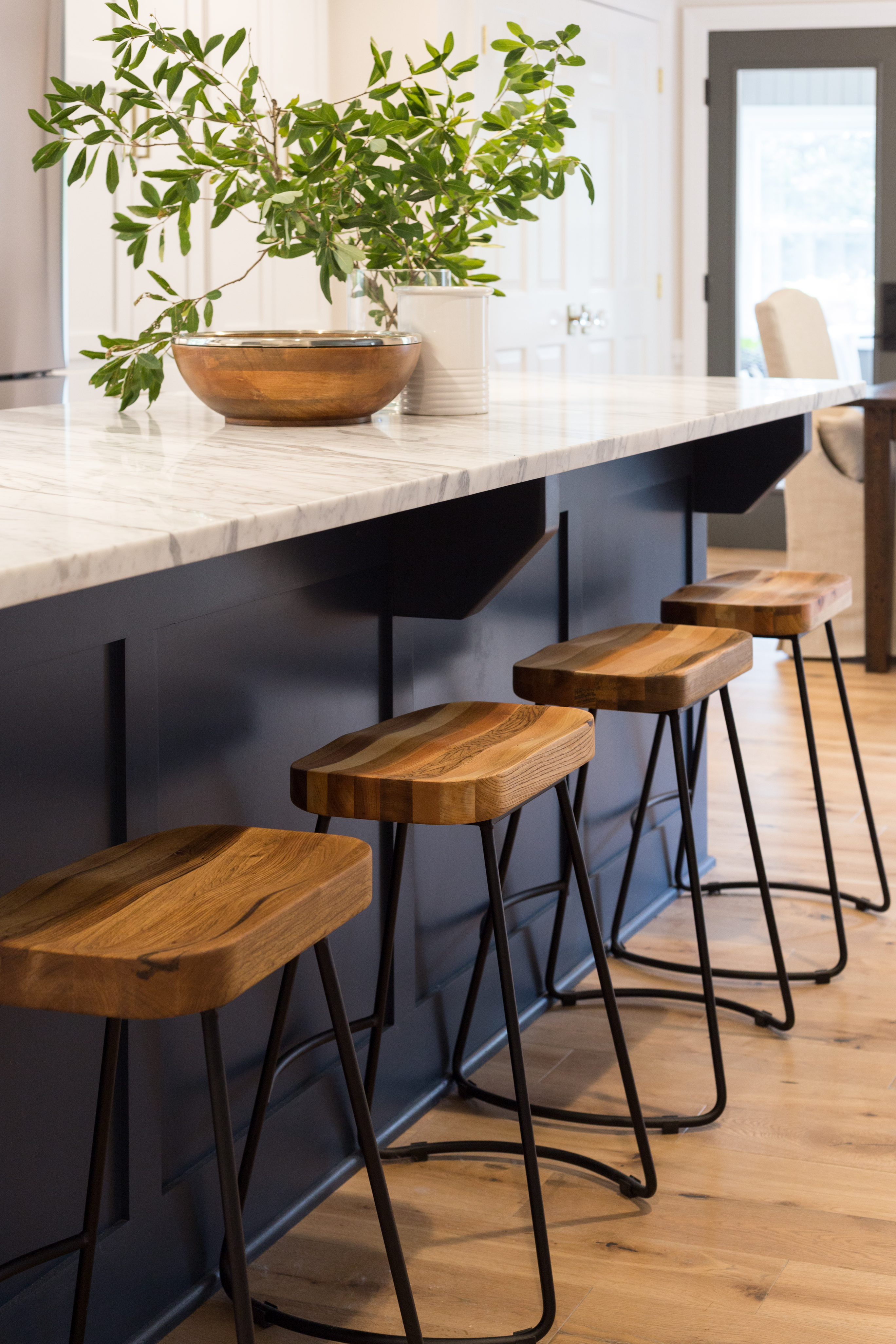
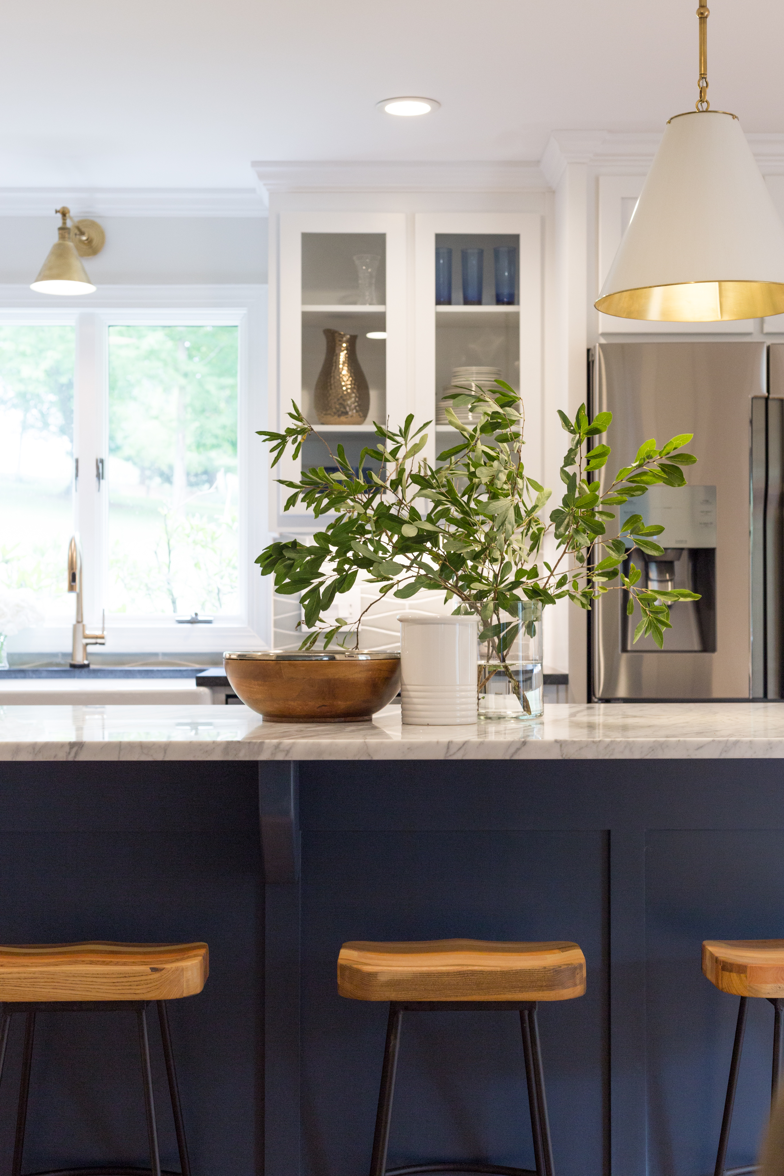
We had so much fun working alongside these awesome homeowners to renovate their home. We love their love of beautiful yet approachable design. And thankfully, the toughest critic around this house — Wojo the Schnauzer — also loves the transformation!
Interior Design: Tera Janelle Design | Photography: Tera Janelle Photography
KITCHEN & DINING: Countertops: Spectrum Stone Designs (Honed Virginia Mist and Carrera Marble)| Backsplash Tile: FireClay Tile | Cabinetry: Custom (Benjamin Moore “Chantilly Lace” and “Washington Blue”)| Sink: Kohler | Faucet: Delta | Flooring: Piedmont Floors | Light Fixtures: Circa Lighting | Door Hardware: Emtek | Dining Table: Restoration Hardware


The Kitchenaid pull out is GENIUS!!!