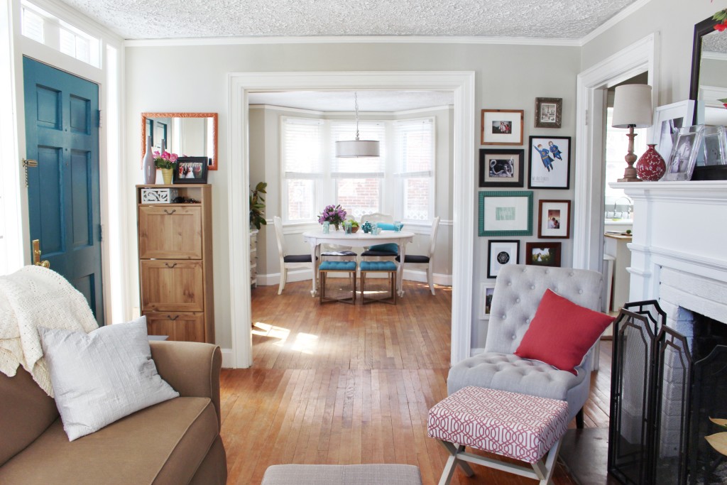
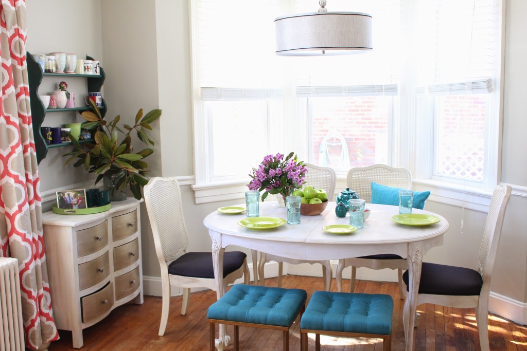
This historic cape cod has charmed us entirely!! Today we’re heading into the Dave + Audrey Project dining room. And whether dinner is take-out pizza or blue cheese filet mignon (because oh my goodness, we love blue cheese) — this classic, colorful dining room has Dave + Audrey covered! The balance of traditional and modern elements, as well as its colorful charm, allow the dining room to easily transition from lazy meals to formal dinners. And the flexible seating and expanding table just as comfortably accommodate dinner for two as Thanksgiving dinner with the extended family.
If you popped by earlier in the week, you saw the Dave + Audrey Project living room reveal. Today we’re peeking in on the equally colorful dining room. The space needed to serve a variety of purposes, so we worked to create a space where all of those purposes could coexist in a way that made sense both aesthetically and functionally. The room is divided into three distinct zones: the dining area, the in-home office, and the landing zone for coats & shoes. Yet the use of repeated colors and the consistent blend of traditional and modern elements throughout the space provide visual links that help keep the room from feeling chopped up.
BEFORE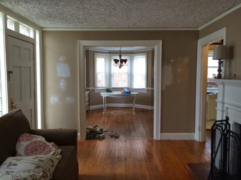
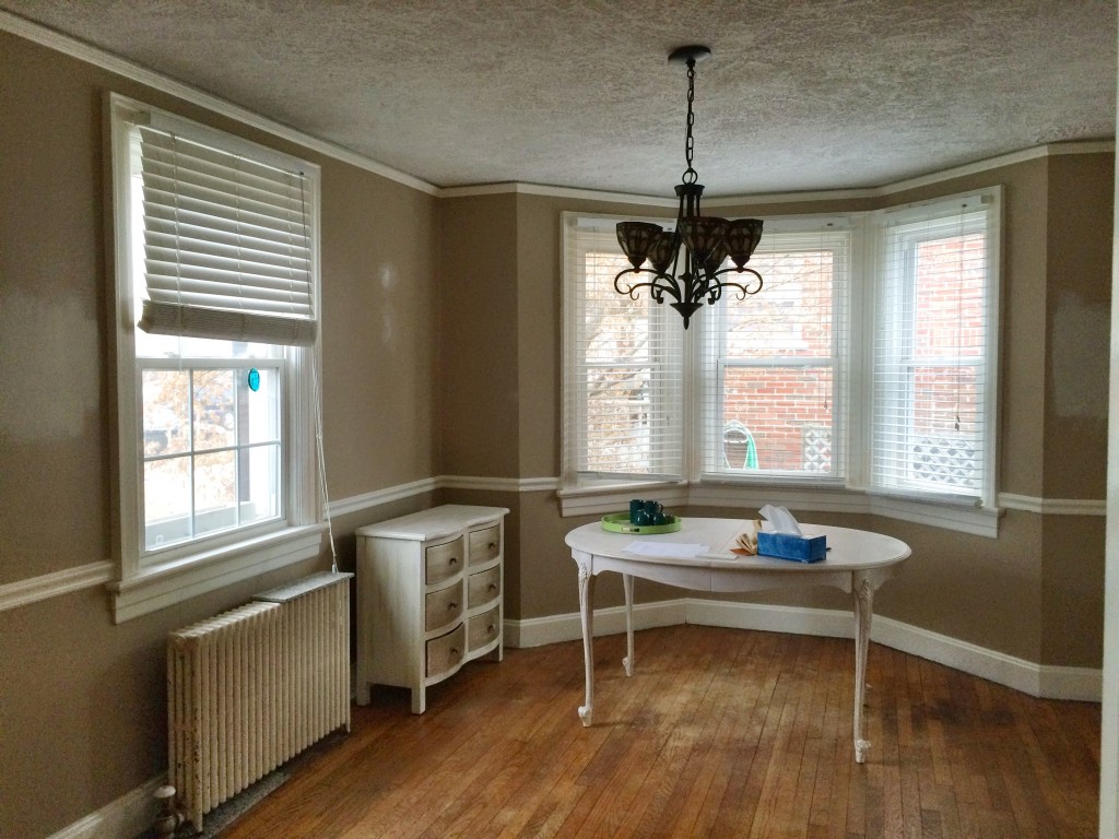
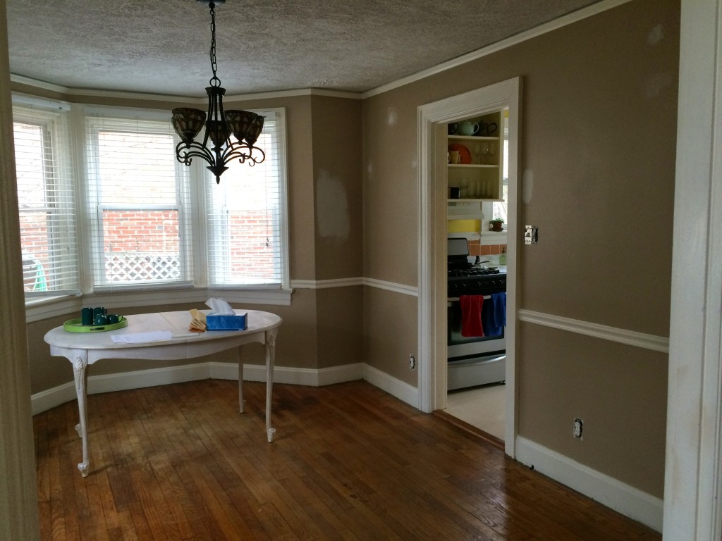
AFTER
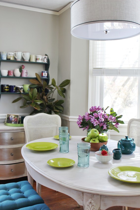
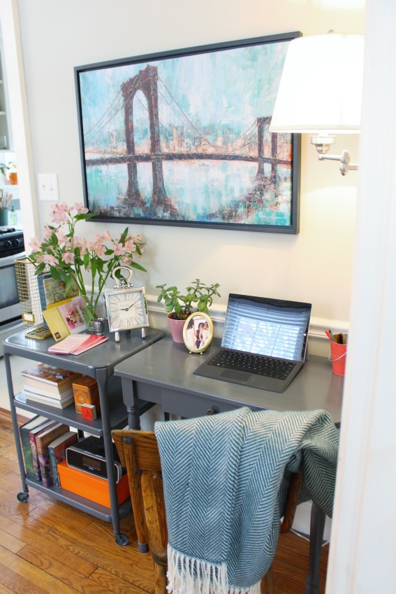
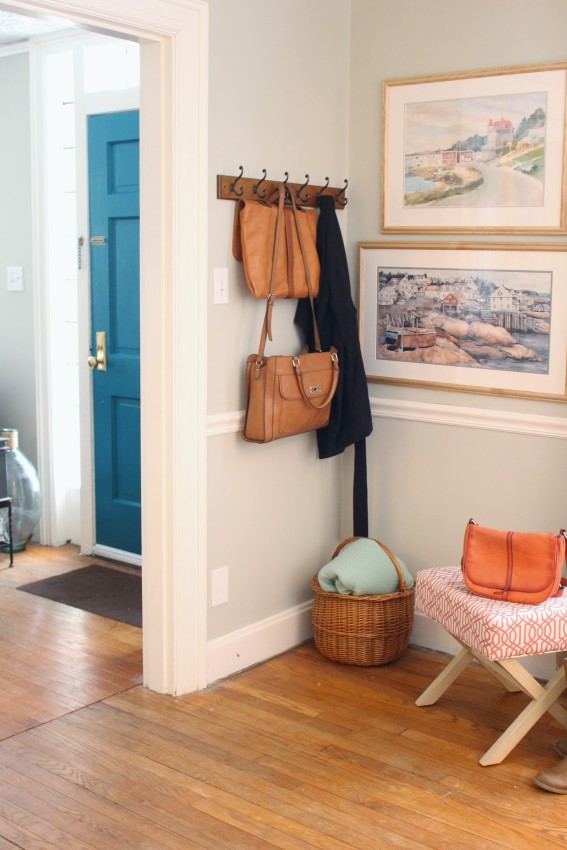
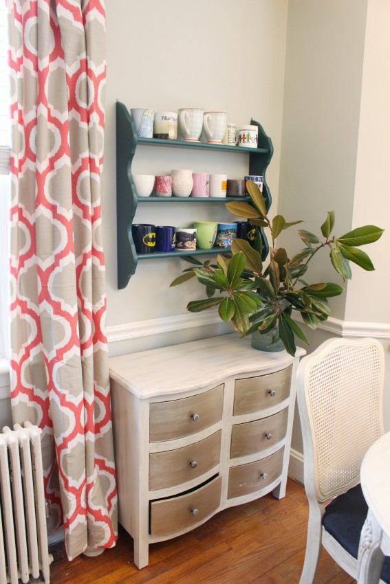
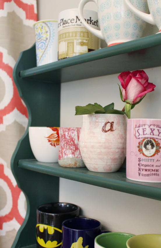
The major furniture pieces in the room (the dining table & chairs, small buffet, rolling storage cart, and desk) were found by the homeowners at antique stores, garage sales, or on Craigslist. Many of those pieces worked well without any updating at all. Others needed just a bit of paint. And in order to make the variety of furniture styles “get along” within the space, we added a few bridge pieces for a sense of cohesion. Because when you have a Sasquatch mug, modern and traditional artwork, and a yellow kitchen-style rolling cart … you need a few design-puzzle-pieces to fill the holes and create one stunning big picture.
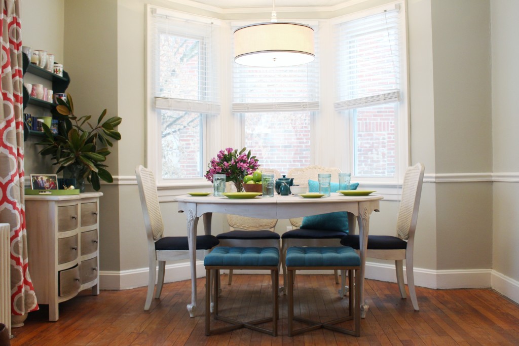
That cohesive big picture was accomplished by balancing the modern and traditional elements of the space. The modern drum shade chandelier and transitional teal dining stools provide a nice balance for the very traditional lines of the dining table and chairs. The chairs’ dark navy, almost black fabric provides a visual anchor for the pops of color bursting throughout the rest of the room, as does the subtleness of the gray desk and muted tones of Dave’s grandmother’s watercolor paintings. These quieter pieces allow for the bright pops of color (that Audrey loves so much!) to fully shine without becoming overwhelming
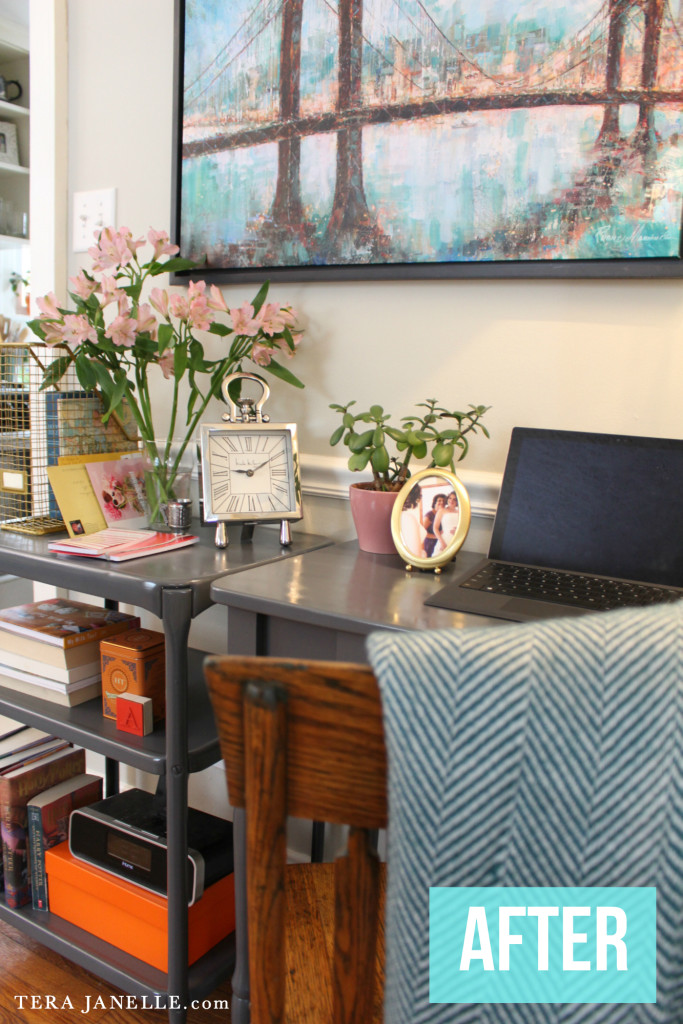
- Desk space: (Oh this absolutely charming desk space, I just want to pick it up and carry it all to my house!) The gray painted garage sale desk & cart = beautiful & practical! By painting the pieces the same muted gray (Rustoleum’s Dark Gray in gloss), the yellow rolling cart which once screamed “kitchen” now looks totally at home next to Audrey’s petite desk, expanding the desktop space and adding much needed storage. The gray also highlights the beautiful wood tones of the antique chair, while the addition of the herringbone throw brings softness, texture, and color to the otherwise hard lines of the desk area. And the affordable wall-mounted swing arm lamp provides both task lighting and effectively brightens an otherwise dark corner of the room!
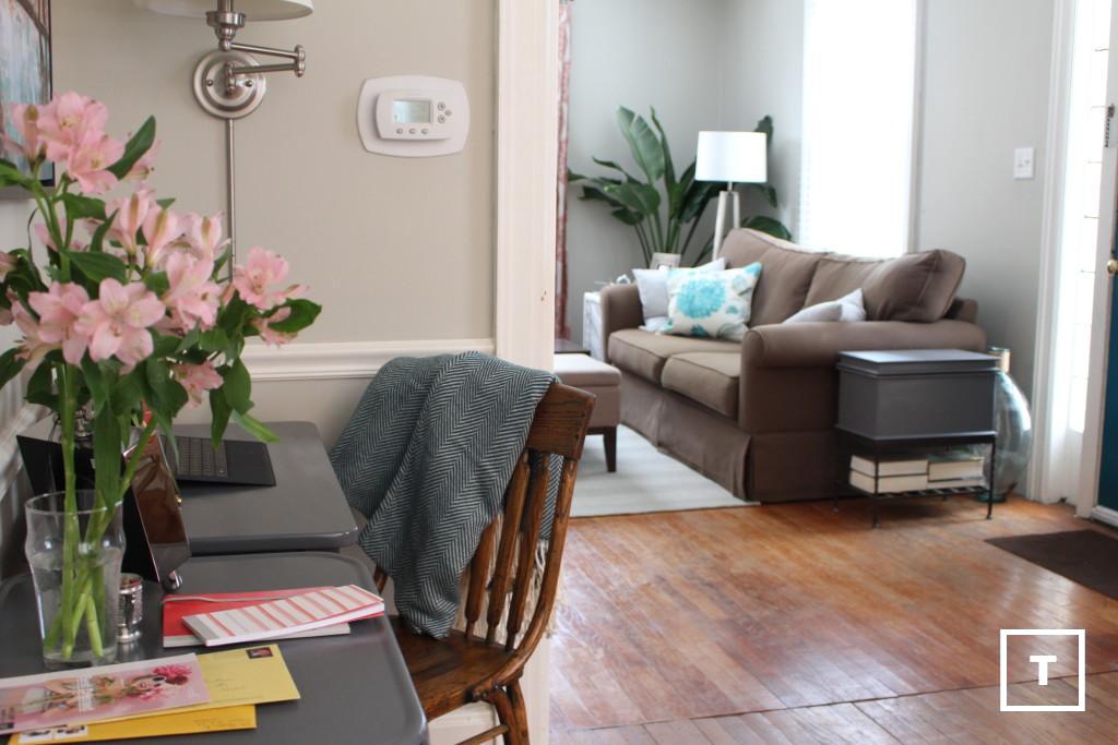

Dining Area: The traditional colors and lines of the dining furniture could have tipped the space too “granny chic” for the homeowners’ taste, but the addition of the transitional dining stools, the pops of color in the table settings, and the modern drum shade pendant light avoid any notions of granniness! Furthermore, the teal stools provide much needed additional seating and serve to repeat the teal accents found in the rest of the home. The stools can also be easily moved into the living room to provide extra living room seating, without screaming “there are dining chairs in the living room!” which would be quite distracting, screaming furniture. :)
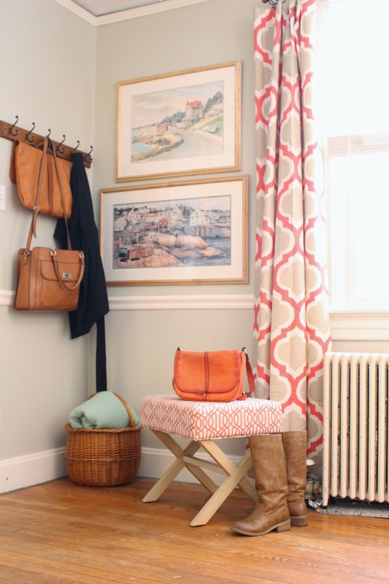
Coat Landing Zone: Because we all need coat storage! By tucking coats and shoes around the corner from the front door, they are disguised from living room view. Open hooks provide easy access to regularly used coats, hats & bags. The coral trellis bench provides a place to sit while putting on shoes, as well as a temporary “drop zone” for mail and grocery bags to free up hands while taking off shoes and jackets. But landing zones need not be only practical! The basket and throw blanket provide texture and softness (and can be easily accessed when extra blankets are needed in the living room), and the beautiful watercolors bring art into an otherwise functional space. The home is lacking on large stretches of wall space, so the homeowners weren’t sure there would be room for these meaningful watercolors (painted by Dave’s grandmother!), but by stacking them vertically, they emphasize the ceiling height and anchor the small space. And the colors in the paintings speak well with the coral in the curtains! (Side note: I love, love, love those curtains! The coral suits Audrey’s love of color, yet the traditional pattern plays to Dave’s more conservative design tastes.)
In the end, this multi-purpose room is colorful, stylish, and functional! The accent colors repeat those found in the living room, and the use of color and transitional design style provide a nice transition into the colorful, eclectic kitchen… And I’ll be back next week with that kitchen reveal! P.S. The ENTIRE kitchen remodel cost only $85!!
