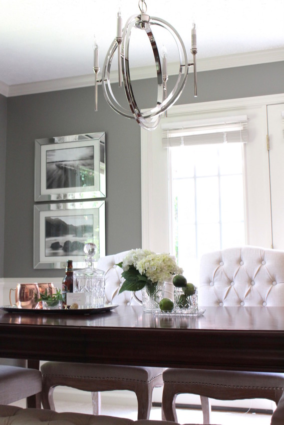
The Forest Project dining room has absolutely stolen my heart!!!
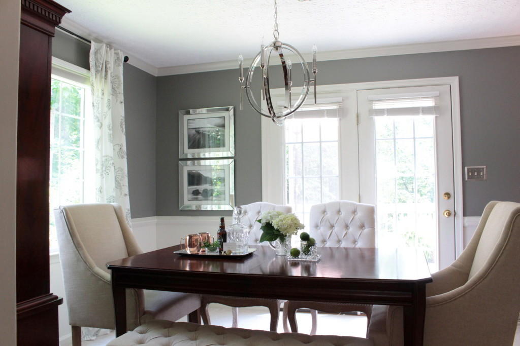
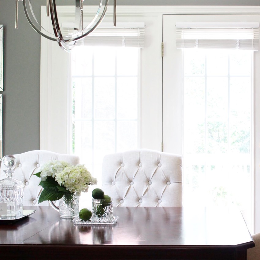
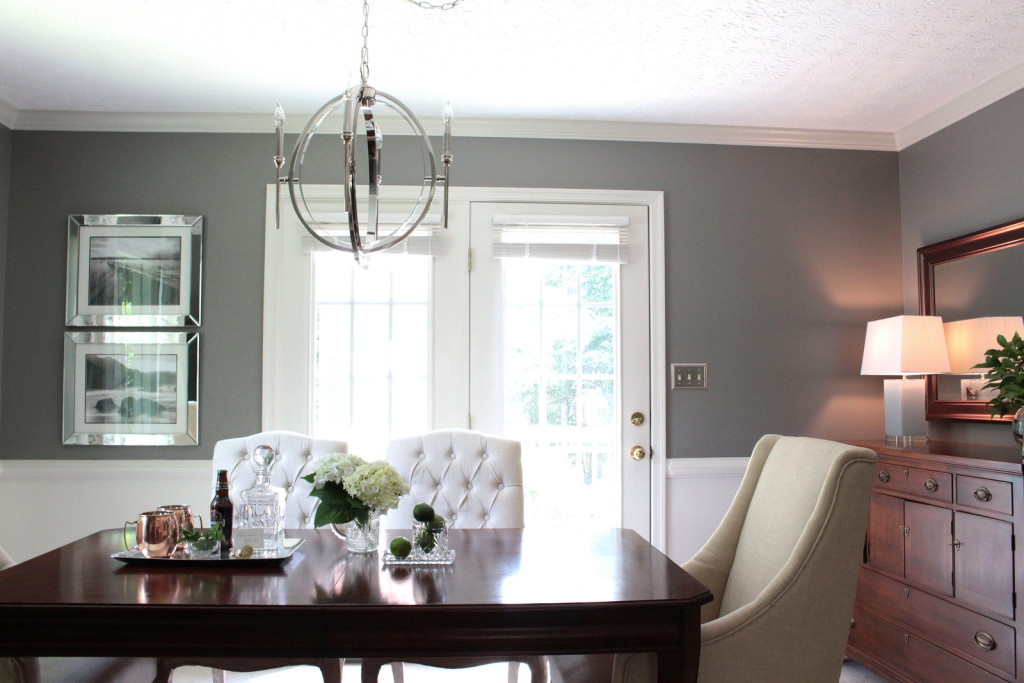
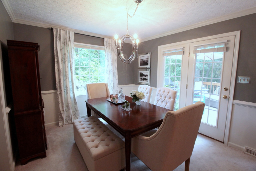
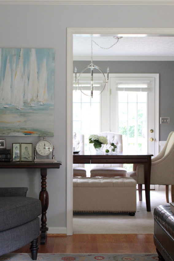
The sultry gray. The streaming sunlight. The heirloom furniture. The elegant tufting. The nailhead details. The chandelier!
But before I delve into all the yummy details of the AFTER, there’s a bit to know of the BEFORE…
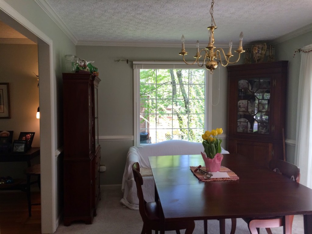
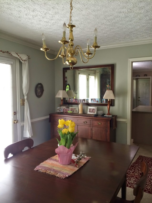
At some point, the Forest project homeowners had become “the keeper of things.” Every time a family heirloom was passed down, every time a family estate was cleaned out, the family furniture, memories, and collectibles made the way to their house. And the homeowners found incredible comfort in knowing that these family heirloom’s were being cherished. But at some point the scales tipped. They were out of space! These heirloom’s had overtaken any sense the homeowners’ had of their own design style.
But the thought of parting with any of the meaningful heirlooms, hand built pieces, or high quality furniture they’d invested in years ago was suffocatingly painful. So a primary focus of this redesign was to embrace these heirloom and cherished pieces, to give them proper position as beautiful, meaningful elements of the home, but also to infuse the home with a breath of fresh air. To lighten and brighten the space. To find designated moments to display the photos and memories, rather than letting them overtake the space. To balance history with the present. This juxtaposition of Fresh & Classic resulted in one of my absolute favorite dining rooms to date! Every. Last. Detail. (Just look at the rich, classic lines of that heirloom furniture!)
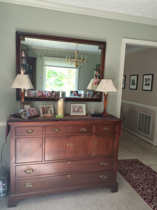
THE BEFORE
THE AFTER
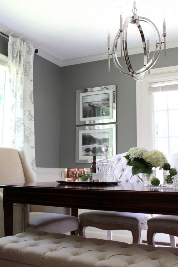
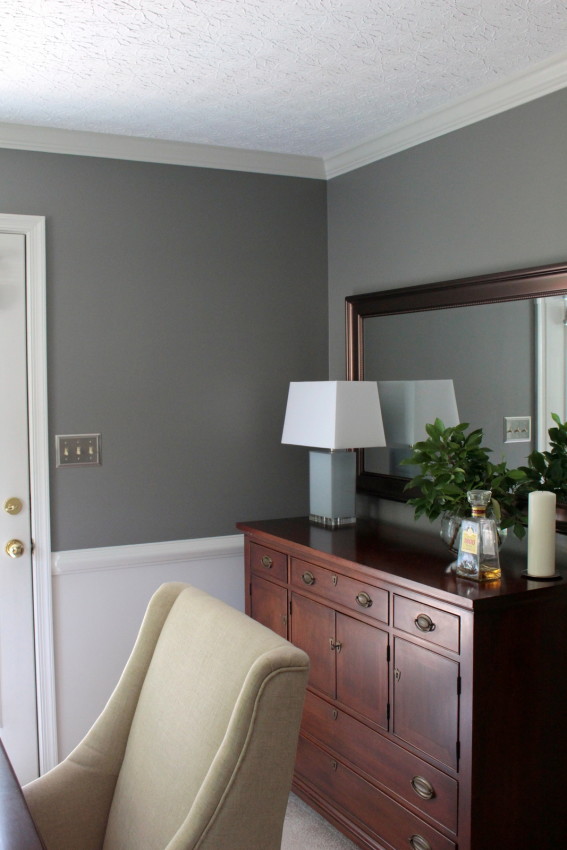
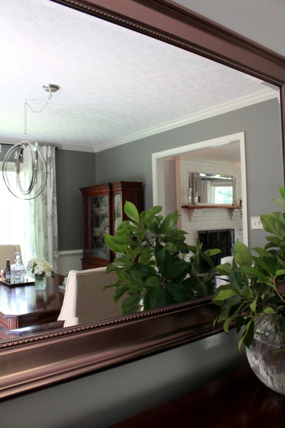
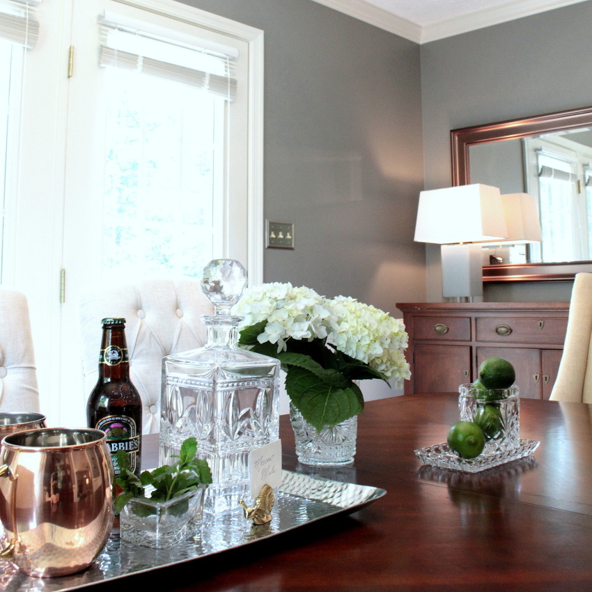
GOING GRAY. The rich, gray walls are an excellent backdrop for the beautiful wood tones of the furniture and the crisp, creamy linens in the room. However, when I first proposed painting the walls a darker gray – I knew I was taking a risk; the homeowners were understandably concerned the space would feel too dark. I hoped some “inspiration” photos might provide a glimpse of how the gray would serve as a complimentary backdrop rather than an over-dominating wall color. This Dear Lillie gray dining room and this one from Make It Luxe provided just the inspirational reassurance the homeowners needed. So the walls went a lovely, rich gray (Chelsea Gray – Benjamin Moore) above the chair rail and the same creamy white of the trim below. In the end, the gray provides a rich and elegant sense of contrast without a hint of gloominess. And most importantly, the homeowner’s love it!
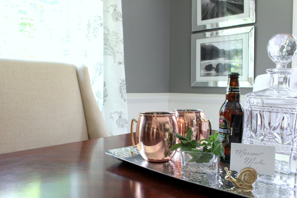
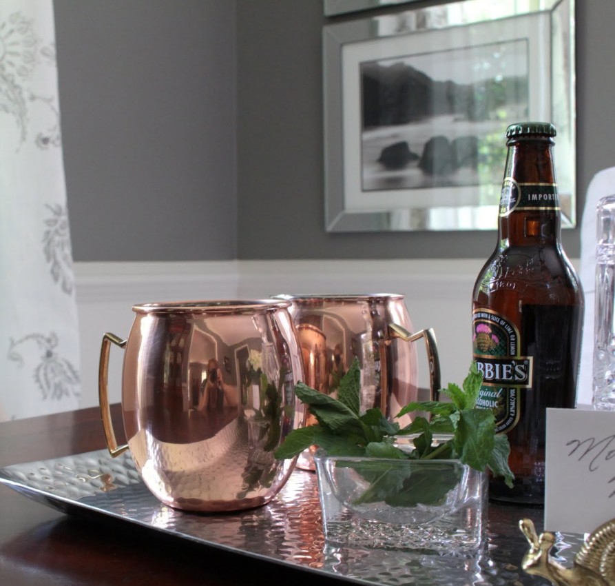
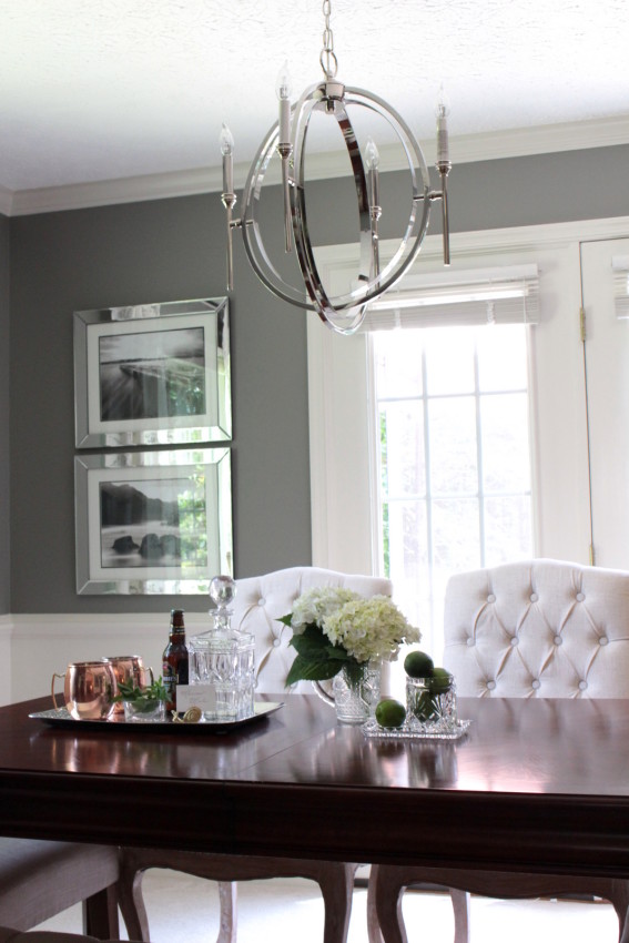
MIXING METALS. Bring on the Moscow Mule mugs! I have long loved these Moscow Mule mugs from Pottery Barn, but at $44.50/pair, they were an unattainable splurge. However, I found these nearly identical, even larger (24 oz) solid copper mugs at a discount retail store for an absolute steal! Copper tones are hot, hot, hot right now. And the copper Moscow Mule mugs provided the perfect linking element between the rich, mahogany tones of the furniture and the cool metals of the polished nickel chandelier and the mirrored frames. And who needs an excuse to drink a refreshing summer combo of ginger beer, freshly squeezed limes, and vodka? Throw in the classic, solid copper Moscow mule mug, and Decor meets Happy Hour in a beautiful way!
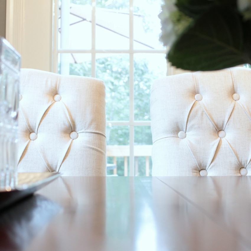
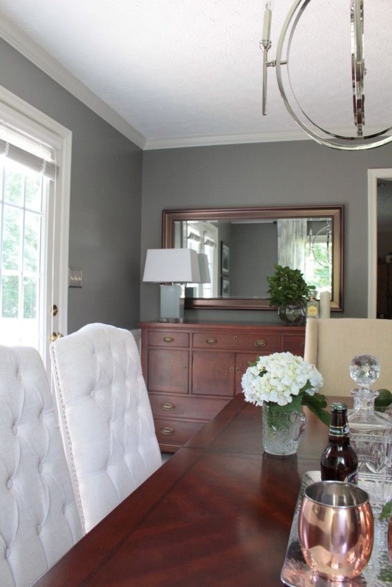
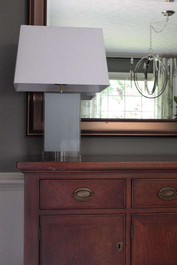
Mixing metals was an important part of freshening up the space and successfully blending the modern and classic elements. The hardware of the furniture is an antique brass, the buffet mirror a tarnished copper, the switch plates brushed nickel, the chandelier polished nickel, the curtain rod aged titanium… Even the nail heads join in the blending of metals. The tufted linen chairs showcase polished nickel nail heads, while the bench features aged copper nail heads. In combination with the mix of woodtones in the space (cherry, mahagony, weathered wood, espresso) — the mixing of metals and woodtones keeps the space from feeling overly matchy and instead speaks to a rich, curated-over-time look!
A SENSE OF SOUL. A FEELING OF HOME. An important part of any good design is making sure the final reveal feels like home, not like a design showroom. The Forest Project homeowners have such a wonderful collection of cherished pieces that ensure their living room and dining room — though entirely transformed — still feel anchored to who they are. The dining room buffet and china cabinet were the homeowner’s great-aunt’s. They are absolutely stunning pieces of furniture. Pictures do not do them justice! The rich finish, the subtle burl of the wood, the classic lines. They are showstoppers, and by keeping the rest of the design decluttered, simple and classic, these beautiful, heirloom pieces now get the full attention they deserve!
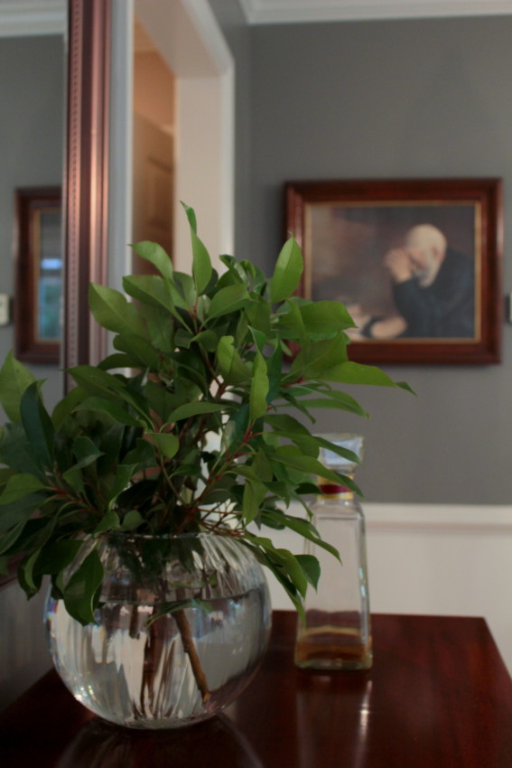
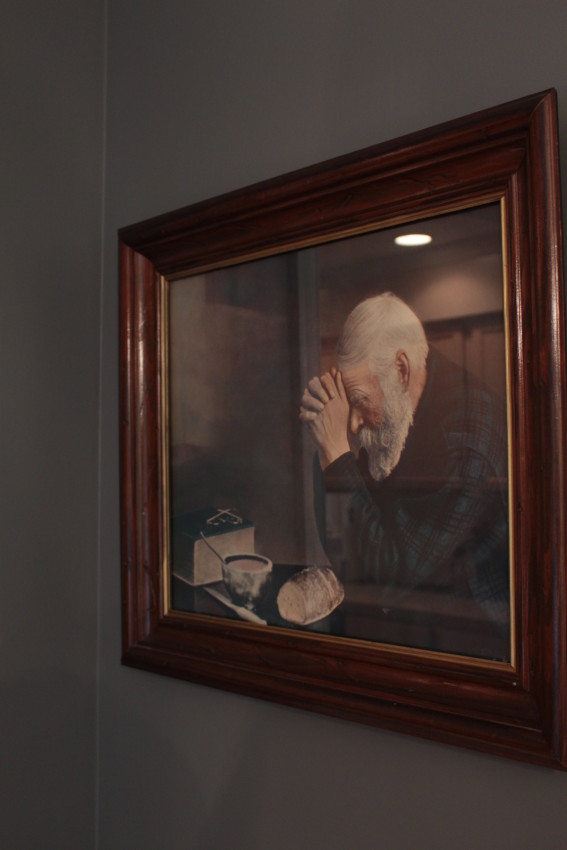
The china in the china cabinet also has sentimental meaning. And the framed artwork of the man praying over his dinner hung in the homeowner’s husband’s home all his growing years, and has since hung in their own home. It will continue to hang in an honored place in their dining room as the homeowner’s grandchildren now grow. There’s simply no replicating the cherished memories a piece like that holds. Incorporating a piece with such incredible history in a fresh & beautiful space is one of the great joys of being a designer. What an honor it is to be invited into people’s homes and their lives, and to be tasked with the great responsibility to showcase such memories. It is these items homeowners beeline to during reveals. They are the irreplaceable elements, the core of really great design.
DINING FURNITURE & MIS-MATCHED LINEN. As we like to say, when beauty meets the budget, that’s our sweet spot! And this gorgeous table was a sweet spot, Craigslist find! The table alone was worth the price, and it came with six chairs! We took them to an Estate & Consignment shop downtown, and when they sell the homeowner will get a nice check in the mail. The tufted linen chairs, captain’s chairs, and tufted bench all came from different locations. There is a slight differentiation in the color of the linens, but it further speaks to the rich, curated feel of the space.
For so many years I was gripped by the feeling that things needed to match. A 6-piece bedroom furniture collection. A whole living room of matching lamps. A whole house of brushed nickel everything. Serious oops! I’ve since forsaken my matching ways. :) Don’t be overwhelmed by the feeling things need to match. Coordinate, yes, but match, no! Rich, elegant spaces usually break all the matching rules! Take a cue from the stunning, curated homes of Architectural Digest or Veranda or Vogue Living and embrace the freedom to break the rules, to mix metals and wood tones, to overlap design styles, and to mis-match linen fabrics. It’s wonderfully liberating and results in uniquely, exceptional spaces. To keep the space feeling designed rather than disjointed, repeat finishes a minimum of three times within a space. (I owe that tip to someone, at some point, though I have no idea whom to give credit to! THANK YOU to that wonderful person. That tip finally gave me the courage to buy something other than brushed nickel anything!)
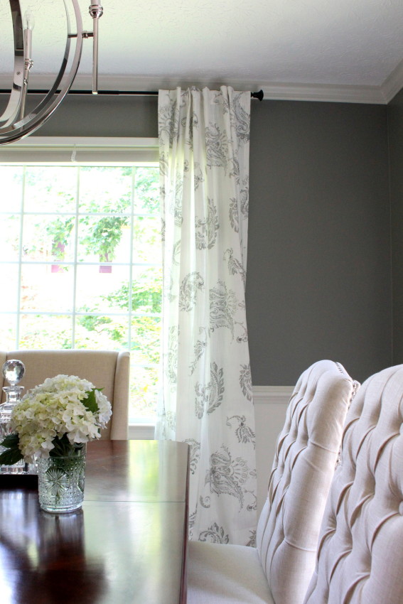
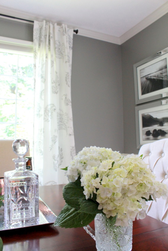
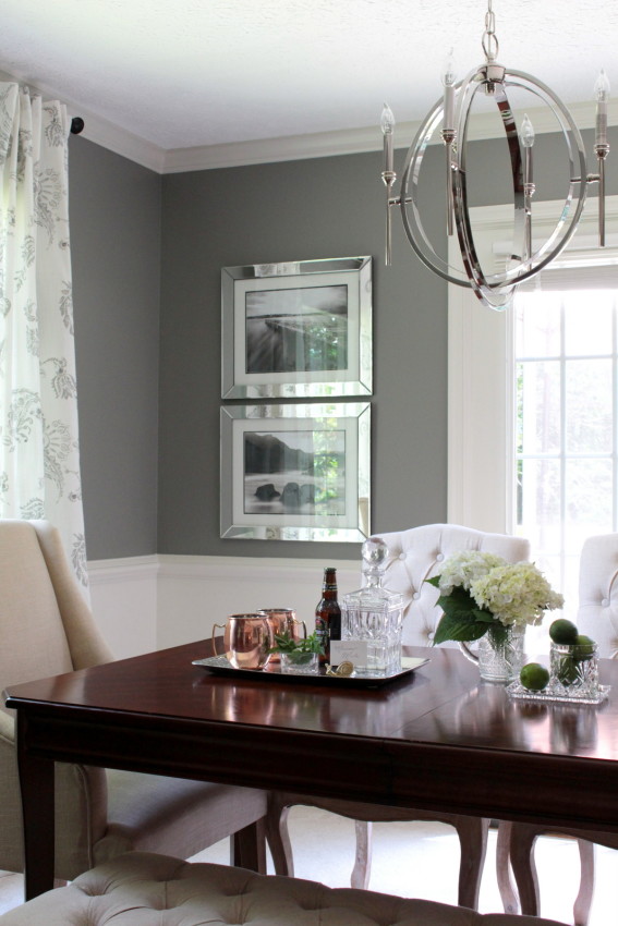
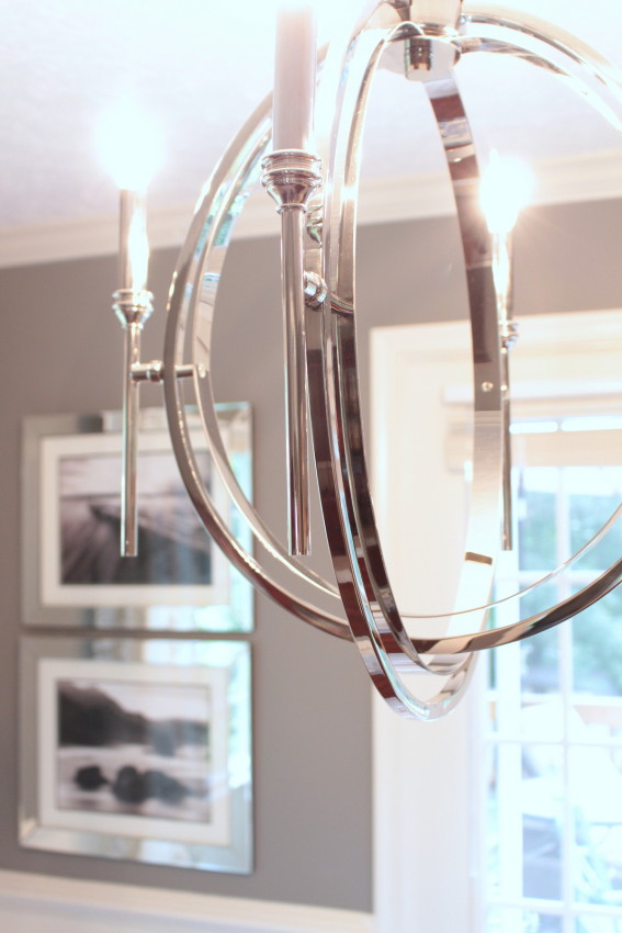
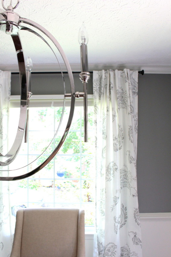
THE CHANDELIER. That wonderful chandelier! If you follow us on instagram, you’ve already been subject to my swooning. I love, love, love the traditional candlesticks paired with a modern shape and polished nickel finish. Love. Love.
Cherished pieces need not be abandon when redesigning a space. The saying is true, “Old can be new again!” I so hope this dining room is a beautiful testament to that point.
That wraps up the Forest Project dining room reveal. If you haven’t already seen the Forest Project deck reveal, you can find that here. It offers a bit of colorful, outdoor inspiration just in time for summer! (And some pics of the adorable, Gracie. She was the cuddly, on-site manager for this project.)
I’ll be back next week with pictures of the living room reveal. Until then, here’s a sneak peak…
Happy Weekend!


Such a gorgeous room, Tera! I’m impressed by the mix of old and new, and agree that the best rooms in shelter mags are the eclectic ones. The chandelier is so gorgeous–love how sculptural it is. I’m sure your client is thrilled!
Sharon, hello and thank you so much for stopping by! New + old rooms are my absolute favorites. How lucky I was the homeowners had such an incredible collection of beautiful furniture and memorable items! They made my job an easy one. :)
gorgeous! Love everything about this room! The chandelier is such a nice update to the original!
Oh goodness, I still daydream about that lovely chandelier! ❤