[ It is week 2 of The One Room challenge. If you haven’t heard of Calling it Home’s One Room Challenge or missed last week’s post, you can find those here! ]
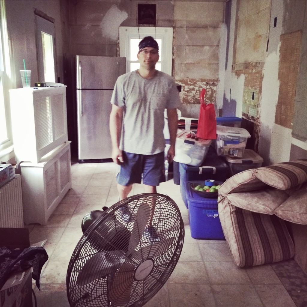
We’ve done ten kitchens in our thirteen years of marriage. Goodness, ten! I can’t believe I’ve gone through this process nine other times and still thought it was a good idea to do it again! Because it’s par for the renovation course, before the kitchen gets better… it gets So. Much. Worse. But enough about the “so much worse” part — It must be the dust. And no kitchen sink. And no microwave. I mean those three things in combination – well they’re practically lethal. ;) But after the dust, comes THIS … And I’m so very excited about THIS part!
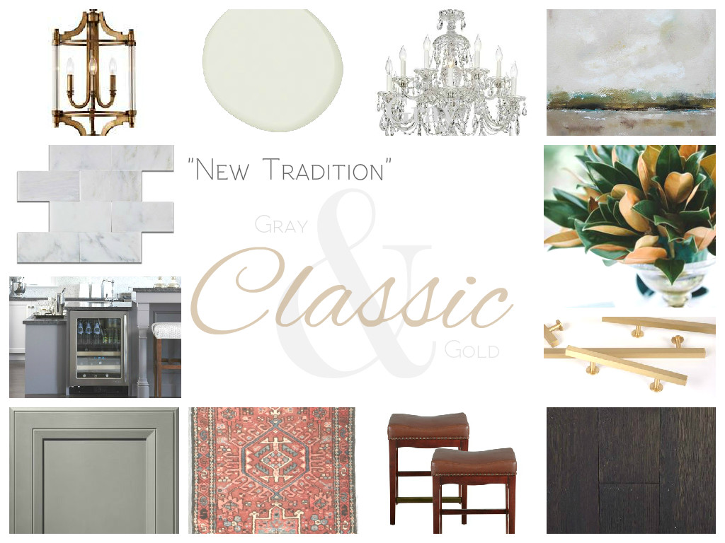
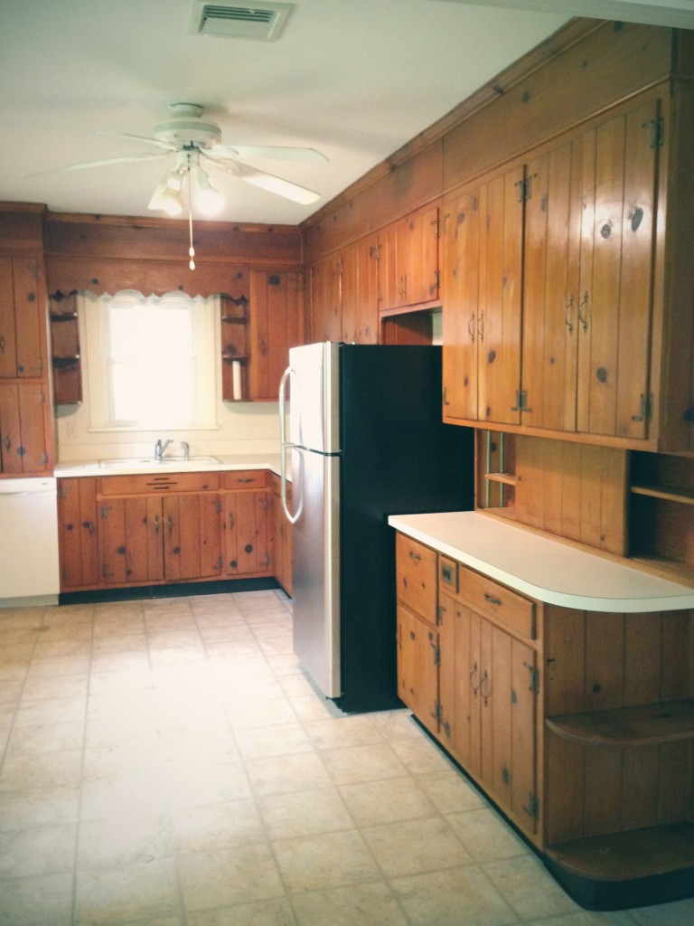
We are taking this 1940’s cape cod back to its classic, traditional charm. Because somewhere along the way, someone went all-knotty-pine cabin in this cape cod kitchen. And while I love a modern kitchen, this house calls for something classic. Classic and charming, with some modern conveniences of course.
HERE’S THE PLAN:
1 // A Gold “Lantern” Style Pendant – to hang above the kitchen sink (such as this Lamps Plus beauty). The clear glass sides maximize light output, a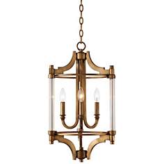 nd it’s just so darn pretty! But at almost $300, the Lamps Plus option is definitely beyond the budget. So I’m on the hunt for a “look for less.”
2 // A Light Gray Paint – on the olive side of gray (maybe Benjamin Moore’s Stonington Gray?). I don’t want the paint color to compete with the gray on the cabinets, so I’ll wait until the cabinets come in to choose a final paint color for the walls.
3 // A Crystal Chandelier (with 7+ lightbulbs for plenty of light) – I use the word “crystal” loosely; I’m definitely open to look-alikes.
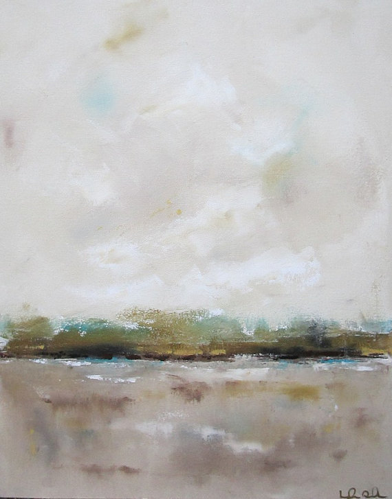 4 // Abstract Coastal Artwork – because we have both blank wall space and an obsession with coastal artwork! I’m aiming for abstracts so the space doesn’t lean too traditional.
5 // Magnolia Leaves – I’m a Southern girl at heart, bring on the vases of magnolia cuttings!! (Thanks to our neighbors’ tree.) The copper colors of the leaves will serve as a nice reference to the gold throughout the kitchen, and the greenery will help to keep the cool, gray tones from feeling overly cold.
6 // Gold Cabinet Hardware – that strikes a balance between modern and classic.
7 // Wood Floors – Hoping to carry the oak floors from the rest of the main floor into this space, both for the visual warmth (gray + dark stained oak = ❤) and overall cohesive flow. Though I’m flirting with the idea of a darker stain than the mid-tones in the rest of the house…maybe.
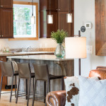
8 // Bar Stools & Eat-In Counter: I’m both stressed about and excited for the eat-in counter. The square footage of the kitchen is adequate for an eat in space, but the placement of the radiator and windows is going to make things tricky. This will be a unique DIY project to be sure. We’ve got our sketch pads out! (Though we’re stick-figure level artists, prepare yourselves.)
 9 // Kilim Runner: I want the warmth, traditional feel, and texture of a kilim rug, without the kilim price. (Who doesn’t?) Any suggestions?!
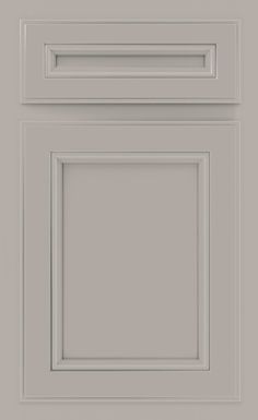
10 // Gray Cabinets: Gray is the new white! I still love a white & marble kitchen – we will forever be in love, I’m sure of it. But white cabinets just weren’t the right fit for this cape cod. I wanted something cozy, something classic in a warm and traditional way. So we’ve decided on Diamond Prelude cabinets from Lowes – the Kelby door style – in the color Cloud. Diamond’s price point was pretty great, especially for a 5-piece drawer front (well, considering our other options at least. Cabinets are budget hogs!) We’ve used Diamond several times in the past, and fingers crossed, so far so good!
 11 // Furniture Style Island: Island isn’t the right word – it’ll be more of an eat-in counter along the window wall, but I’d like it to feel more like a piece of furniture than cabinetry. Like the turned legs of this beautiful kitchen inspiration by Sarah Richardson! I wouldn’t mind the wine fridge too, but I’ll have to stick to just the turned legs. :)
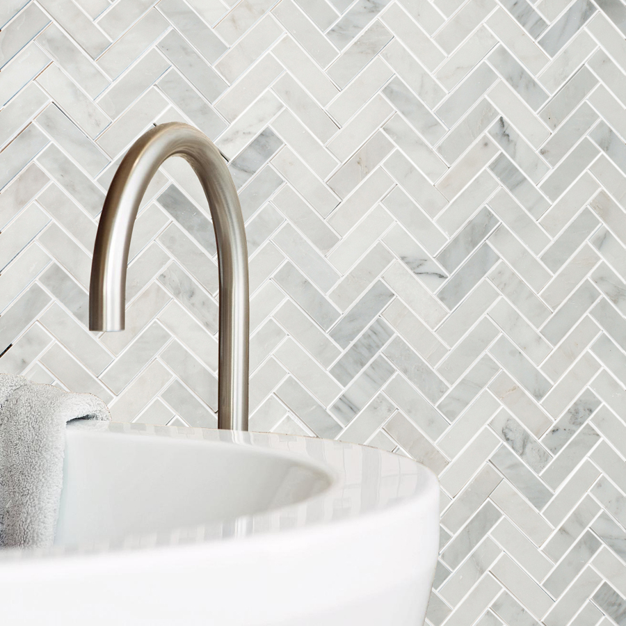
11 // A Marble Backsplash: I just can’t quit you! We might dive in for a little visual interest and go with a herringbone pattern like this one by Allen Roth, but there’s something about a classic 3×6 white marble subway tile that still gets us every time!
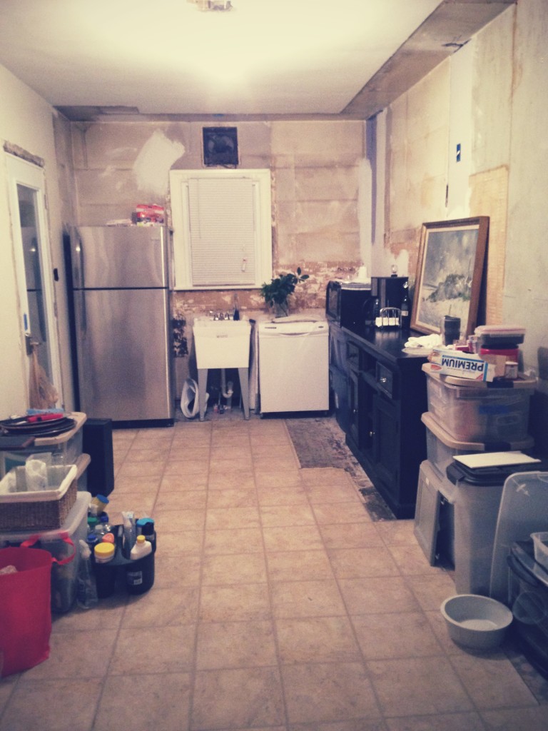
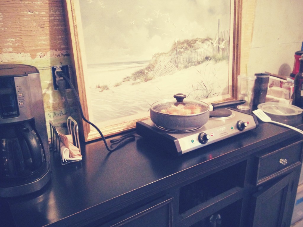
In the meantime we’re living it up ghetto-style around here! This laundry tub is currently serving as our kitchen sink, and our dining buffet is covering as “counter space.” But we’ve got a coffee pot, this framed seaside print, a hot plate, and wine glasses – so there’s that! (P.S. That dishwasher is just for show – not actually functioning, but at least it’s providing a bit more counter space. I even brought in magnolia leaves, I’m not exactly sure why. But even amidst all this chaos, they still make me smile! )
So that’s the plan. I’ll be back with more on the kitchen progress next week. Between now and then, we’ll be dreaming of microwaves and marble backsplashes! You can also follow along as other ridiculously talented designers tackle their own One Room Challenges at Calling It Home!
(Confession: We jumpstarted this project several months ago, cause we had a 6 week wait just for the cabinets to arrive. So we definitely fudged this 6 week timeline a bit — now fingers crossed we can still be done by May!)
In the meantime, yesterday we posted pictures from the Dave + Audrey Project living room reveal . . .
And I’ll be back tomorrow with pictures from their dining/home office reveal! We turned a kitchen-style rolling cart into desk storage and used a Sasquatch coffee mug as decor. Seriously. :) There’s a first time for everything.
WOW Can’t wait to see your vision come to life! Going to look beautiful!
I’m so inspired by all the spaces on the One Room Challenge this spring! Such motivation!
Tera, thanks for visiting my site. I love your choices for fixtures and finishes. The gold is going to look sooo awesome. Can’t wait to see what wall color you settle on.
I don’t know quite when gold came back around with such a vengeance, but I’m smitten!
And seriously, I am still thinking about your shower… so inspired!
Oh my goodness, ten kitchens!?!?! Why so many?? I’m really loving your abstract piece, and the entire design plan. Can’t wait to see more! : )
Michaela,
Moving for life and work, but mostly I think, because we just don’t know how to sit still! :)
Thank you for stopping by – I can’t wait to see what you do with your guest room chair!
WOAH 10 kitchens in 13 years!!! That’s crazy but SO fun! This one will be nothing short of perfect! Can’t wait for the reveal!
I cannot wait to see how this kitchen turns out. Your ideas are so wonderful. Excited to follow along!
Erin, thanks for stopping by! I’m excited to have an entirely functional and “finished” kitchen someday soon. :)
I love the Nickel paint color for your One Room Challenge bath!
I am in LOVE with this space, but was hoping you could answer a question about the cabinets. My husband and I are embarking on our third kitchen remodel in five years and leaning towards Diamond cabinets. I’ve picked out the same color, but different door style … How did you feel about the True Color finish? Are you happy with the quality? I’d love to hear your thoughts. Thank you!
Hi Mary, we’ve worked with Diamond on 8 or so kitchen projects. For the price, the quality has been very good – as has the longevity of finish. We would definitely use the True Color finish option again. The finish is scrubbable and has held up like a champ. And we and get so many compliments on the gray. Thanks for stopping by, and best of luck on your kitchen renovation! You sound like pros tackling your third kitchen in five years. Or crazy! ;) So fun!
Would love to know – what wall color did you end up using to go with the cloud cabinetry? Thanks!!
This is a custom mixed color, but similar to Benjamin Moore’s Silver Chain.